Celebrating 60 Years in Design
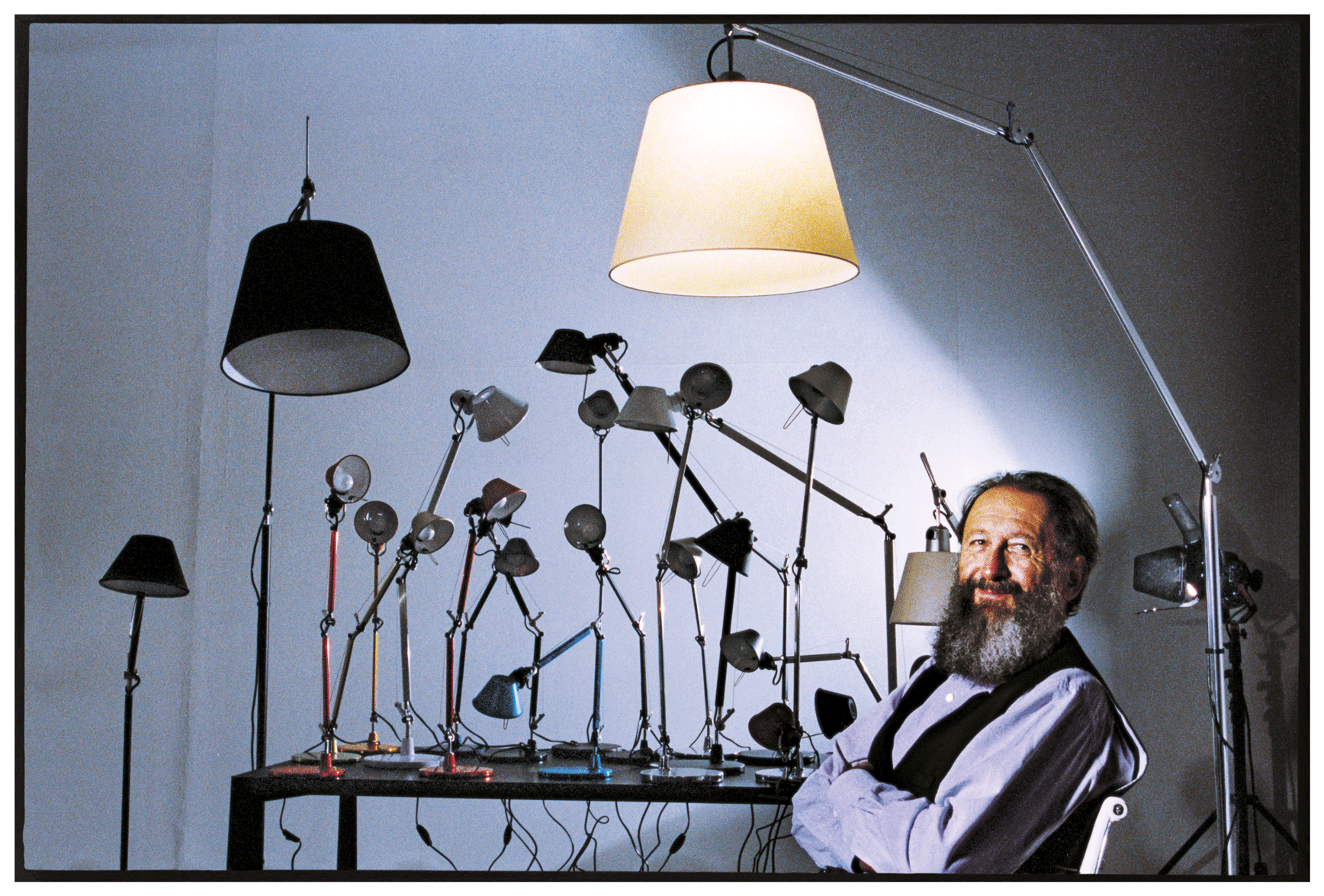
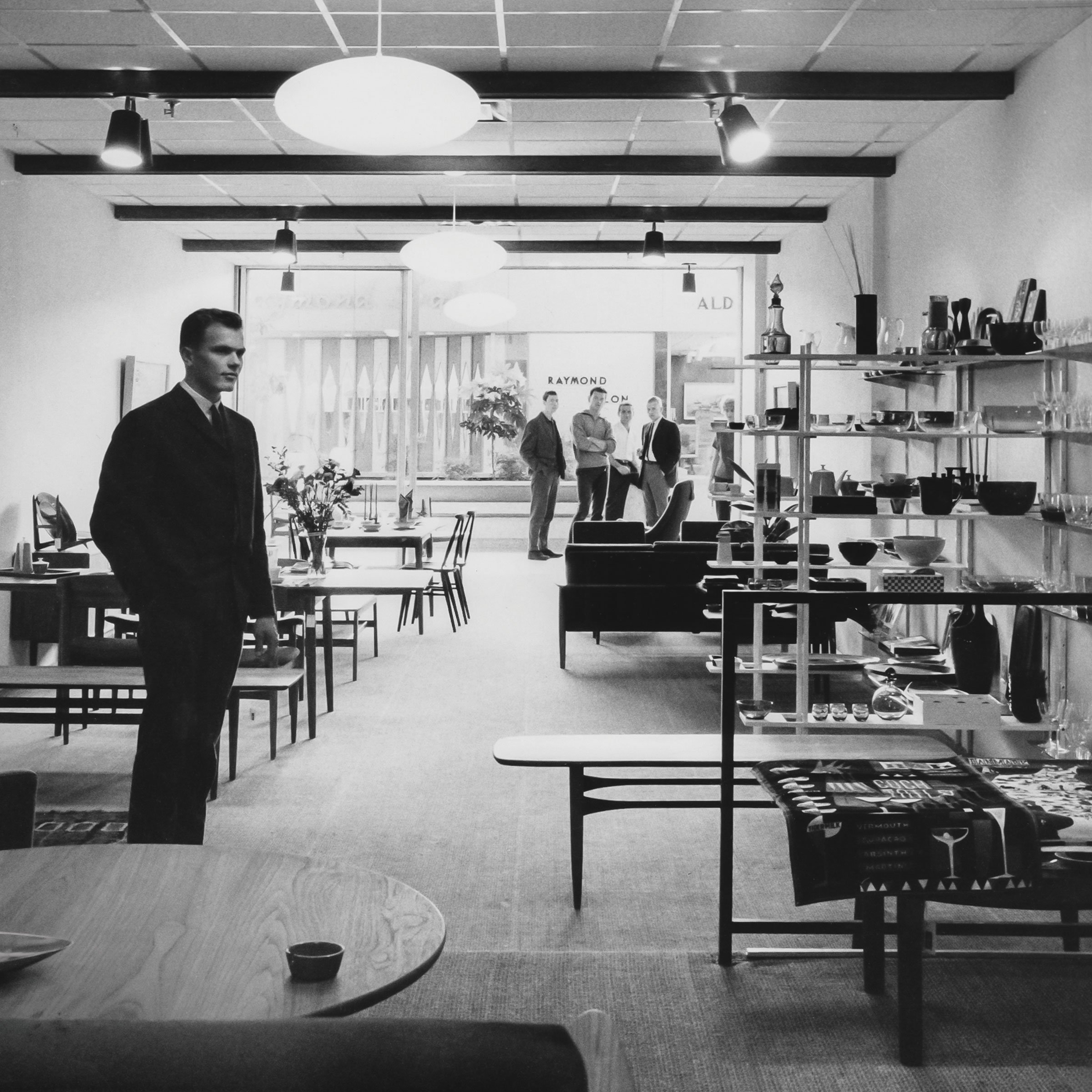
Inform was founded under the name Danet Interiors in 1963. Our first location was in the Park Royal shopping mall in West Vancouver. Pictured above is Inform founder, Niels Bendtsen, in that first showroom.
1960s
Toio Lamp by Achille and Pier Giacomo Castiglioni for Flos • 1962 •
Toio Lamp by Achille and Pier Giacomo Castiglioni for Flos • 1962 •
This lamp has a fascinating history that blends innovation, functionality, and a touch of artistic brilliance.
This lamp was an instant icon, drawing from Marcel Duchamps' idea of the 'ready-made' by putting found objects together to see what happened, capturing the imagination of design enthusiasts worldwide. The Toio's unique structure consists of a slender steel stem, weighted by a car headlight, while an adjustable brass hex nut serves as the lamp's height regulator. To create this captivating piece, the Castiglioni brothers drew inspiration from an unexpected source — the simple elegance of a fishing rod and its counterweight. With its industrial aesthetic and clever use of everyday objects, the Toio lamp continues to symbolize Italian design ingenuity, making it a treasured addition to any modern interior.
Hollywood Vases
by Ettore Sottsass, 1962
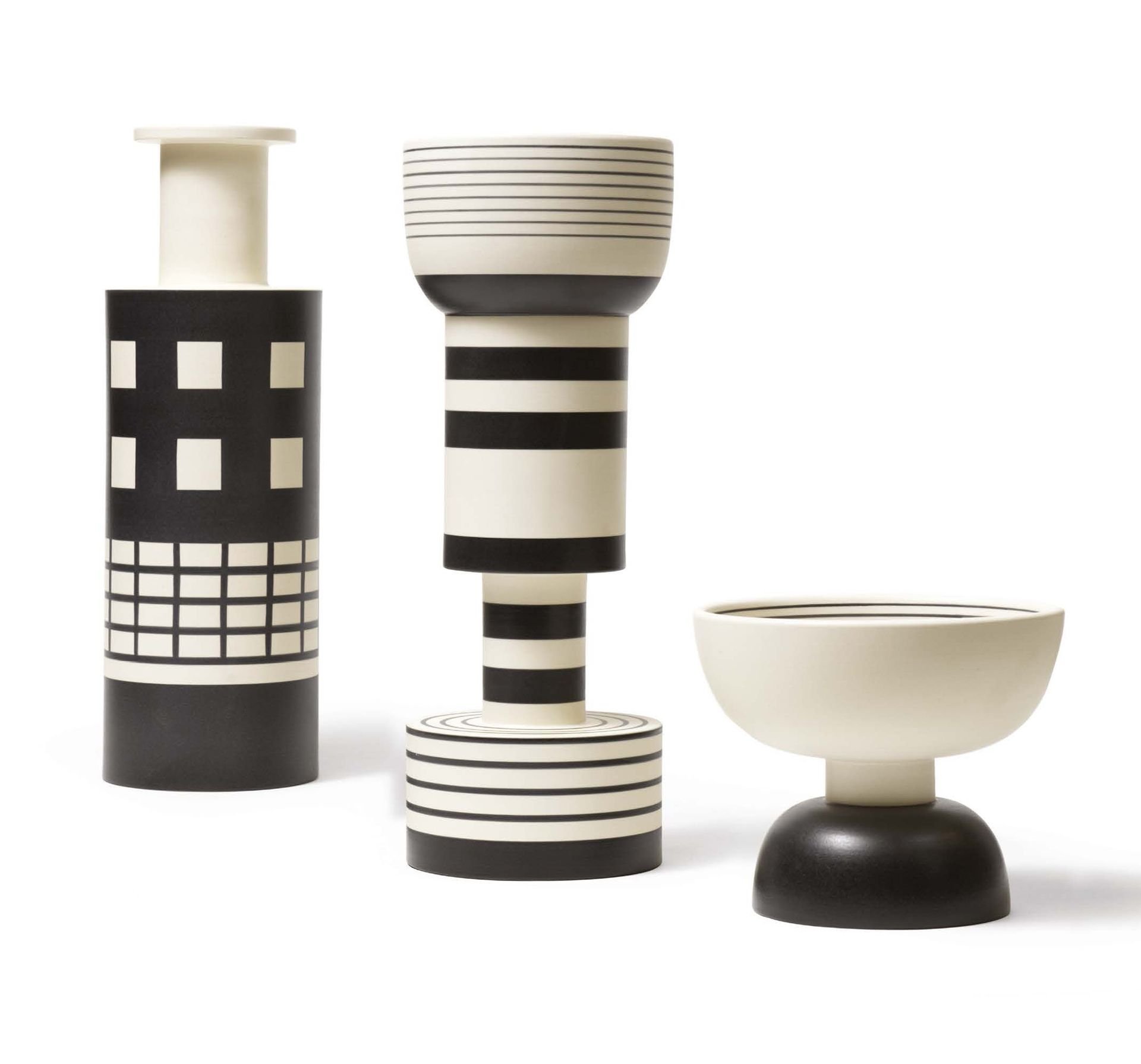
Designed by Ettore Sottsass in 1962 and produced by Bitossi, Italy, this is the designer's much-loved Rocchetto vase that has been in production for several decades. Sottsass created several prototypes of this vase, referred to as Rocchetto or Reel. The black and white windowpane graphics reference early 20th-century Austrian geometric abstraction, accentuating the vase's clean, streamlined shape. Sottsass executed his vision in numerous forms: ceramic, painting, sculpture, furniture, photography, jewelry, architecture and interior design and later began research with creation and industrial strategy. Ettore Sottsass founded the Memphis Group in Milan in December 1980.
Karuselli Chair + Ottoman
by Yrjö Kukkaparo for Artek, 1963
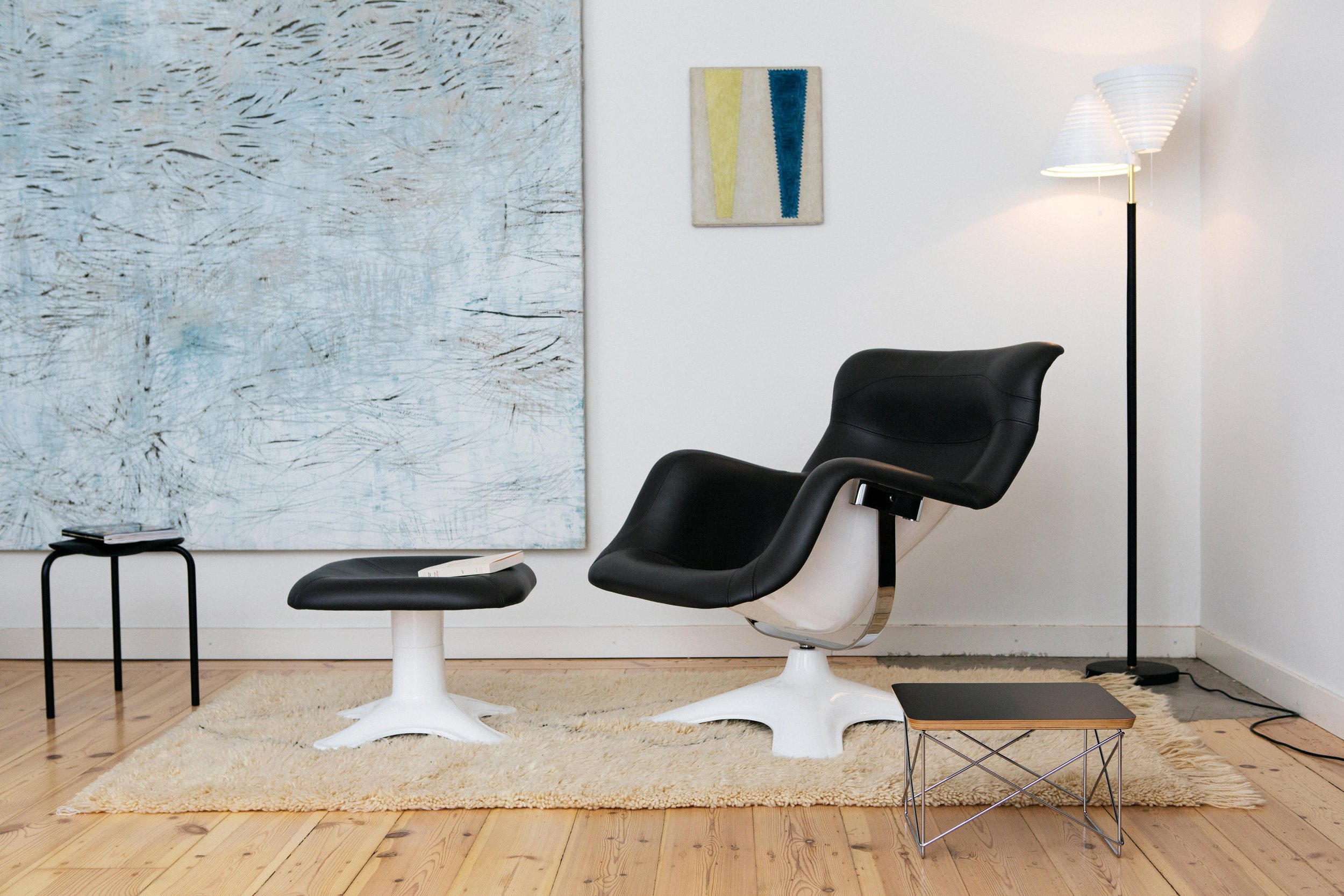
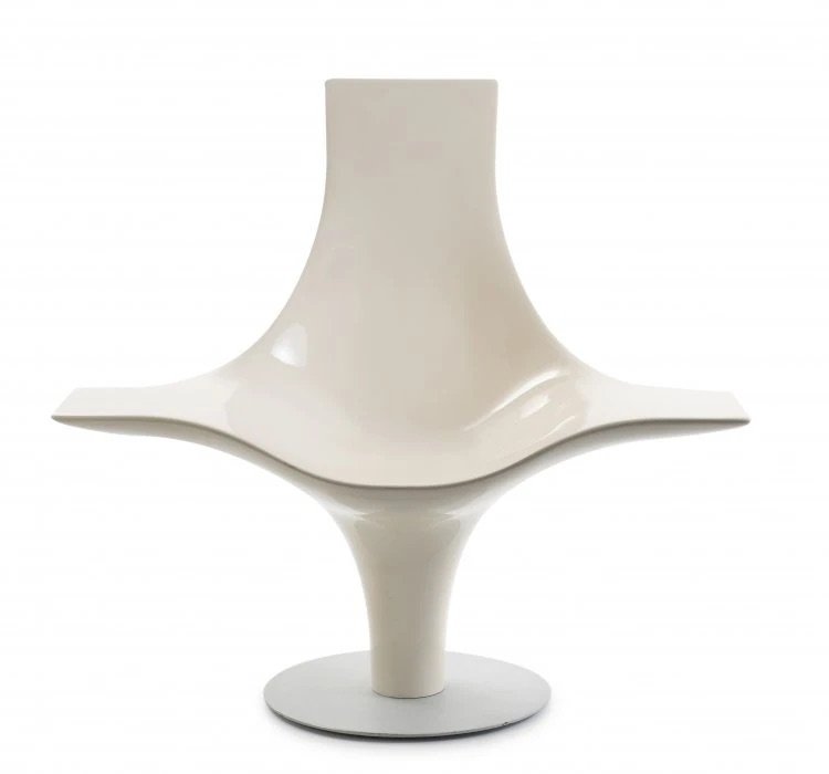
The Karuselli chair and ottoman, designed by Yrjö Kukkapuro, hold an important place in the history of modern furniture design. Introduced in 1964, this iconic duo quickly became a symbol of Finnish innovation and Scandinavian aesthetics. Kukkapuro's inspiration for the Karuselli chair came from his fascination with space travel and ergonomics. The chair features a distinctive fibreglass shell, which effortlessly curves around the sitter, providing exceptional comfort and support.
Its unique swivelling mechanism adds an element of playful interaction, allowing users to rotate freely. The accompanying ottoman perfectly complements the chair's design. The Karuselli chair and ottoman exemplify the marriage of form and function, showcasing Kukkapuro's visionary approach and commitment to creating timeless, ergonomic seating solutions. Today, they continue to captivate design enthusiasts and stand as timeless icons in furniture design.
Inform Permanent Collection
Panton
by Verner Panton
for Vitra, 1963
Verner Panton was known for his innovative use of materials and colours. The Panton chair stands out for its sculptural design, made possible through a single piece of moulded plastic. This design gives it a fluid and organic appearance and makes it solid and durable. Despite its popularity today, the Panton chair initially faced challenges due to its unconventional form. However, over the years, it has become recognized as an icon of modern design and is now part of numerous collections in museums worldwide.
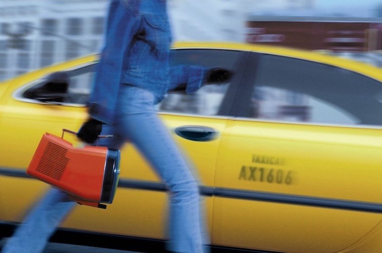
Brionvega Algol TV by Zanuso and Sapper, 1965
1964 introduced us to the groundbreaking work of philosopher Marshall McLuhan and the warning that The Medium is the Message. At the same time, across the Atlantic, Marco Zanusa and Richard Sapper were busy creating a portable television that M. Zanuso compared to a little dog that looking up at its master. It has an organic shape with rounded edges, angled up to be viewed even while on the ground. It embodies a new participatory relationship between ourselves and the television itself.
Inform Permanent Collection
Spider Light
by Joe Colombo for Oluce, 1965
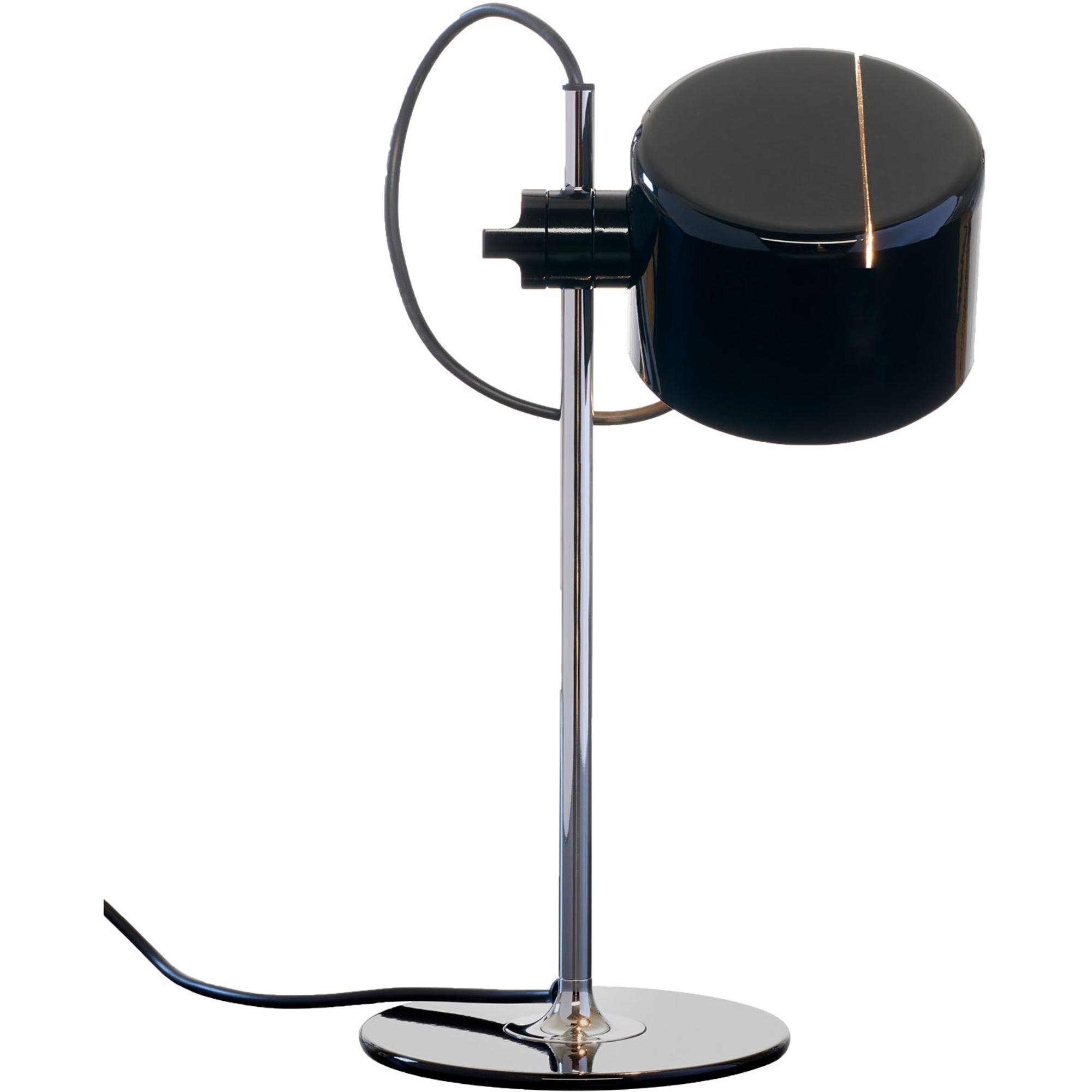
Joe Columbo achieved more in just 10 years of his short-lived life than many of us do in a lifetime. His work was informed by the avant-garde art scene of the early fifties, the perfect environment for Colombo to begin germinating his philosophies on designs for the future. Colombo produced an extraordinary number of furniture and appliance designs. Among his best-known appliance designs are:
The Optic alarm clock (1970).
An air conditioner for the company Candy.
The lighting fixtures Circlope (1970) and Spider.
The classic Spider table lamp is the timeless table lamp par excellence that Joe Colombo also used in his home. The joint in the arm makes it possible to pivot, turn or adjust the height of the reflector in one easy step.
"We will have to make the home live for us, for our needs, for a new way of living more consistent with the reality of today and tomorrow.”
Bulb by Ingo Maurer
1966
A conventional light bulb shines with a mirrored dome inside a body made of mouth-blown crystal glass from Murano with a chromed metal base. The swinging sixties were at its height: paper dresses, the Velvet Underground and a show by the master of Pop Art, Roy Liechtenstein. What better time to launch an oversized light bulb? Ingo Maurer really captured the zeitgeist with this bright idea. By 1968 Bulb was already included in the permanent collection of the Museum of Modern Art in New York City, a bright start to a long and fruitful career as a lighting designer.
Coupe Lamp
by Joe Colombo for Oluce, 1967
Maverick Joe Colombo expanded his seminal Spider family of lights in 1967, adding various sizes from a floor lamp to a wall lamp with a semi-cylindrical or semi-spherical dome. Over the years, many versions have been generated, evolving through the decades as timeless pieces able to fit into any decor. His vision of intelligent technology and integrated living environments had a revolutionary impact on mid-century design. Colombo believed that he could create the "environment of the future" with objects and systems that could adapt to suit any space, a new way of living.
Valentine Typewriter
Ettore Sottsass for Olivetti, 1969
In 1968 Ettore Sottsass lifted the lowly typewriter from its association with the drudgery of typing and turned it into a Pop inspired, sexy piece of office equipment. In bright red, with several orange scroll caps based on Tom Wesselman's nudes, it turned a mechanical act into something unexpected. The "red machine" that "came out a mistake" was intended to be an inexpensive portable typewriter with no lowercase letters, no bell, and a cheap plastic case, but Sottsass objected. It never reached mass audiences but captured the heart of design fanatics forever. Sottsass turned the Valentine into something that forever changed our relationship with technology, paving the way to our love affair with candy-coloured Macs and zippy cellphones.
Inform Permanent Collection
Sacco
by Gatti, Paolini and Teodoro for Zanotta, 1968
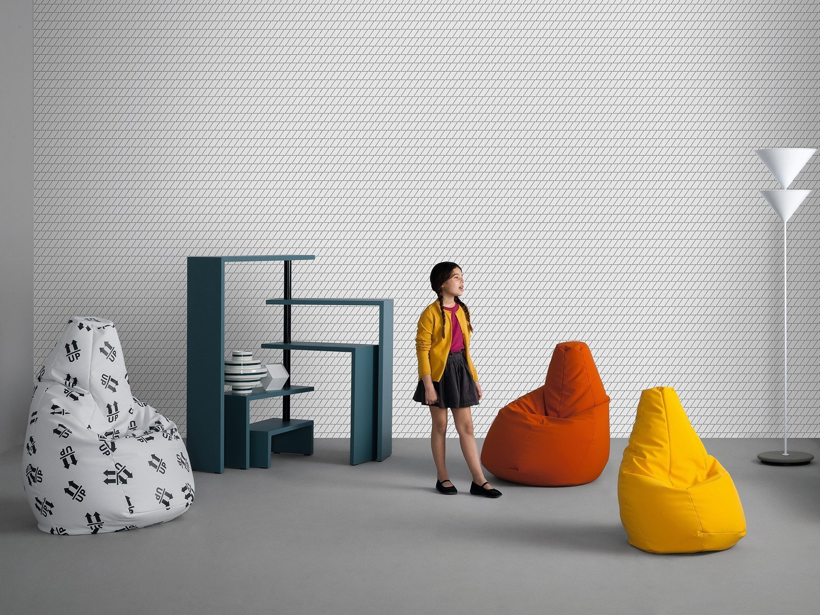
Over 50 years ago, one of the most innovative and imitated pieces of furniture in the history of design was born: the Sacco chair by Zanotta. Chances are we’ve all come across one version of this or another, but the original was indeed a marvel of simplicity and comfort in keeping with the let-it-all-hang-out ethos of the sixties. The brainchild of three designers from Turin — Piero Gatti, Cesare Paolini, and Franco Teodoro — the piece was presented in 1969 to Aurelio Zanotta, a leader in anti-conformist design, as a transparent vinyl sack filled 2/3 of the way with tiny balls of expanded polystyrene.
“In the end, we thought about the old mattresses stuffed with chestnut leaves, widely used by peasants: You take a sack, you fill it with leaves or similar materials, and this moulds itself to fit the body.”
Selene chair
by Vico Magistretti for Artemide, 1967
Magistretti was a prominent exponent of Italian Design, the cultural movement and phenomenon that spread Italian style worldwide during the post-war period creating the legend of Italian design. His approach was based on close collaboration between designers and manufacturers throughout the process that started with defining the concept and ended with the execution of the final product. One of the best-known pieces created by Vico Magistretti was the Selene chair which elevated plastic’s image from a material used for cheap imitations to one used for products of desired elegance. Initially conceived in 1961, it took until 1969 to realize the production due to the complex engineering of the S-shaped profile of the chair’s legs, which provides the necessary tensile strength. Comfort was a key aspect: the chair’s seat and back, which have been moulded into concave curves, envelop the sitter and ensure a high level of comfort.

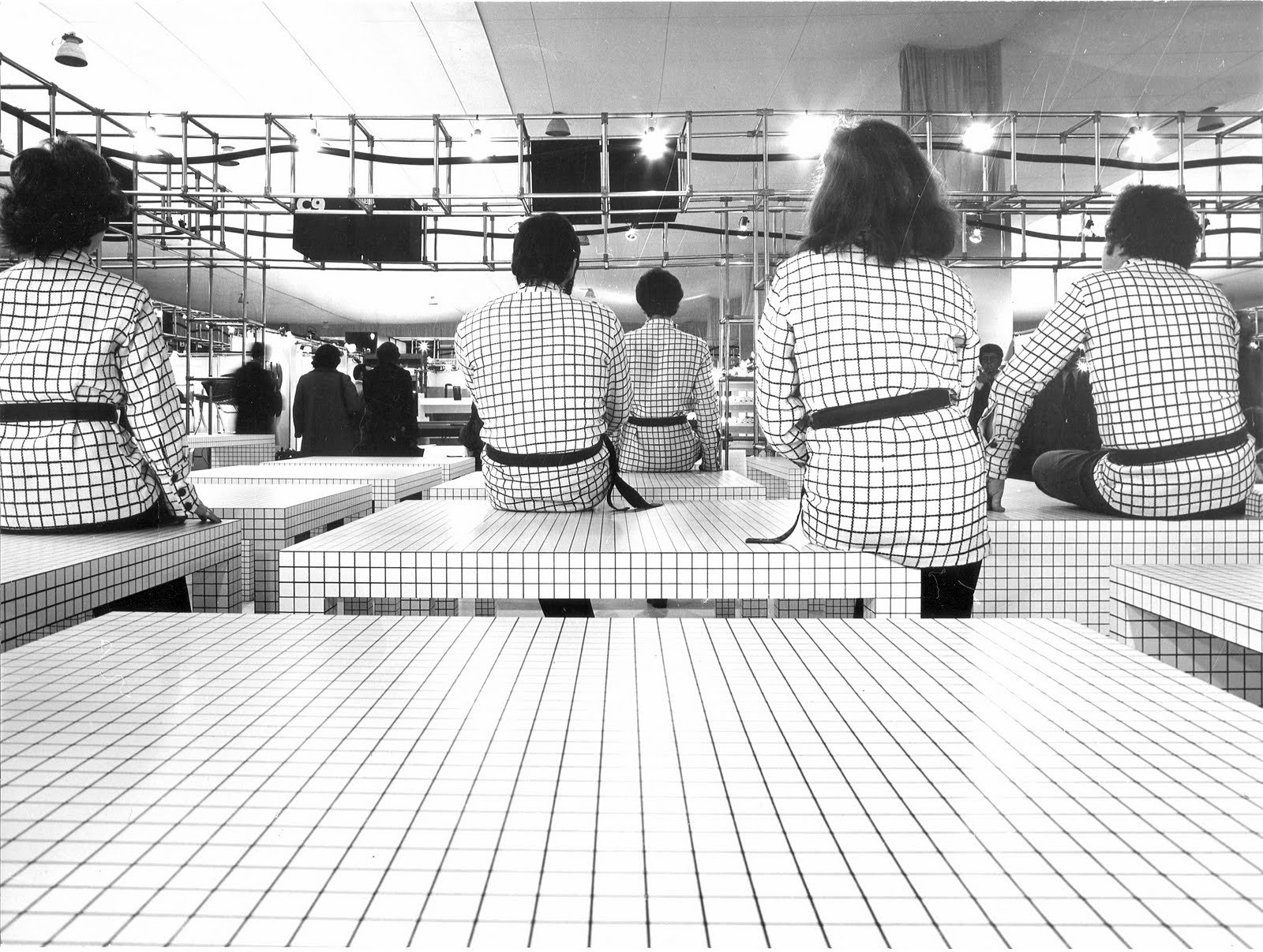
Superstudio was a central part of the Radical architecture movement, founded in 1966 in Florence, Italy, by Adolfo Natalini and Cristiano Toraldo di Francia, later joined by Gian Piero Frassinelli, Alessandro and Roberto Magris. Their ’Super-idea’ Quaderna, which is still in production by Zanotta, is a black and white minimalist furniture collection consisting of architectural shapes that require meticulous precision, taking about eight hours of work to produce a single item of furniture. Guided by their early ideals, they aimed for social change through architecture. They proposed an alternative strategy of life without objects, a view of architectural practice that is essentially theoretical, with a primary focus on cultural criticism. Superstudio was ahead, influencing luminaries Zaha Hadid, Rem Koolhaas and Bernard Tschumi.
Quaderna by Superstudio
for Zanotta, 1969
Up Series by Geatano Pesce for B&B Italia, 1969
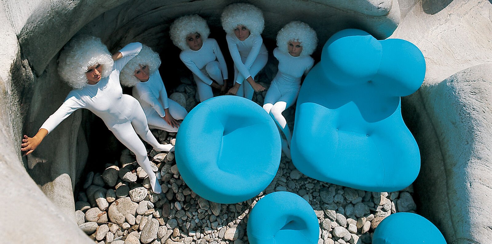
Could a chair behave the same way as a sponge? In 1968 after a typical shower, Gaetano Pesce asked this question and sought a solution in his Paris atelier by experimenting with the new polyurethane material. The material he developed retained the same tactile qualities as a sponge. The shape was rife with meaning, the bulbousness evocative of the silhouette of ancient fertility goddesses and a comment on the prejudice of men against women. He named it simply: Up. Nicknames followed: La Mamma, Big Mama and Donna. Let's sit on that one and think about it…
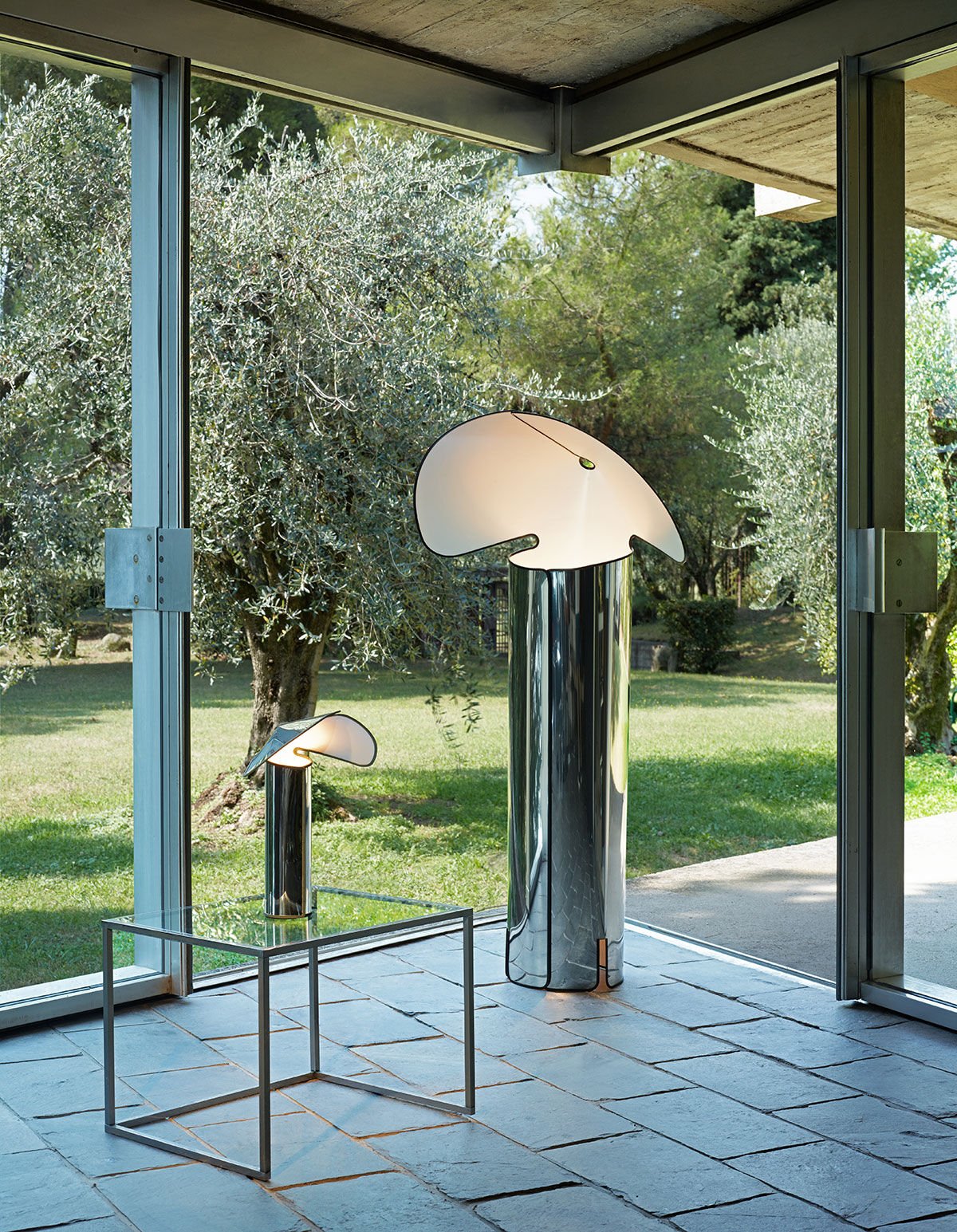
One day in his studio Mario Bellini had the notion that we could “use light in the way it manifests directly, but often through clouds or reflected off objects, walls and surfaces.” The intelligent design of the Chiara lamp shows us how we can take light from an artificial source and see it reflected in the shell that houses the light. He started with scissors and a big piece of card; he began cutting out a cylinder with a hat shape atop, which, when joined, acts like a reflector of the light source within. And to improve on this idea, Bellini also made something easy to deliver: it packs flat.
Chiara Lamp
by Mario Bellini for Flos, 1969

Soriana Sofa
Afra & Tobia Scarpa for Cassina, 1969
In July 1969, the world of space exploration forever changed when the Apollo 11 spaceflight first landed on the moon. Meanwhile, Afra and Tobia Scarpa discovered new possibilities offered by forming polyurethane foam, perfecting their unconventional response to seating. The Soriana successfully launched an out-of-this-world sofa with endless options for lounging or mingling with a new look of leisure that forever changed the world of furniture design.
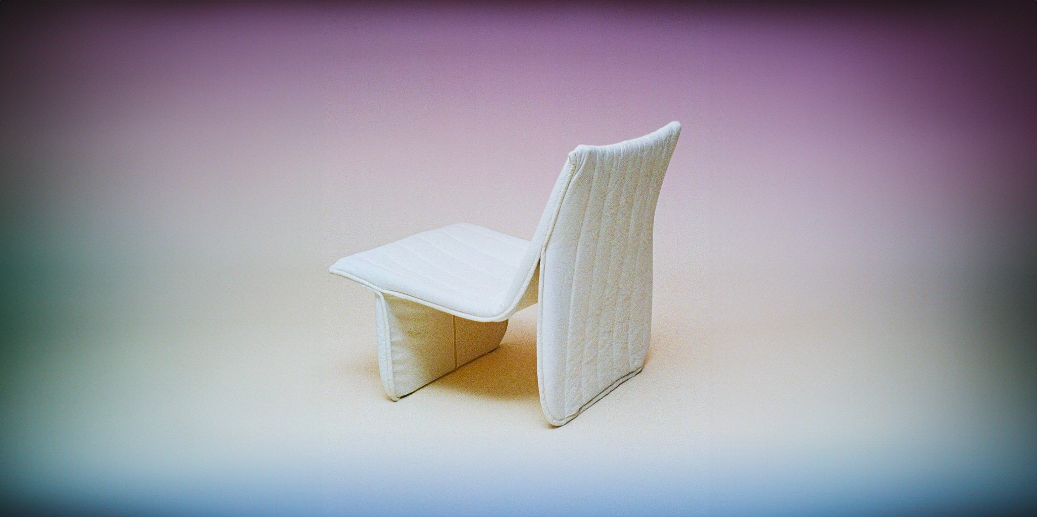
1970s
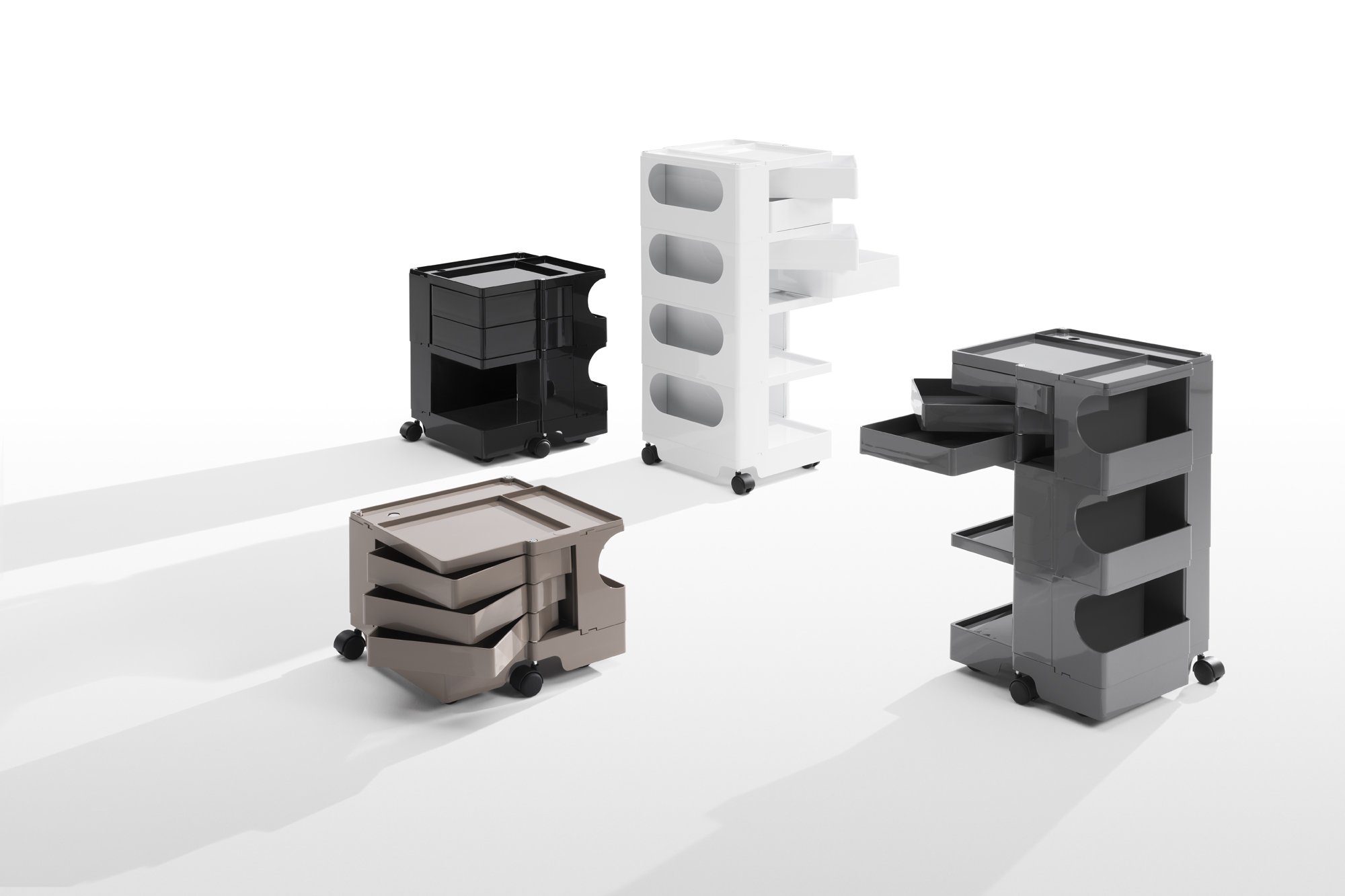
Boby Trolley
by Joe Colombo for B-Line, 1970
Pop goes the Boby! It's the trolley storage unit that made design history; it was awarded first prize at SMAU in 1971 and is part of the permanent collection of the MoMA and the "Triennale'' in Milan. Joe Colombo's anti-design stance led him to develop pieces that demonstrated modularity and flexibility, inflecting his designs with wit and playfulness. The Boby packs all these attributes into one compact package; the ultimate storage unit with injection moulded plastic drawers and compartments offers easy storage solutions, making it one of the most popular storage trolleys for home or business.

Camaleonda ·
Camaleonda ·
Mario Bellini for B&B Italia, 1970
The Cameleonda's name, from Camaleonte (Italian for chameleon) and Onda (wave), describes the shape and the function. Designed in 1970 for B&B Italia, this distinctive and innovative piece of furniture was first introduced in 1972 in the exhibition Italy: The New Domestic Landscape at New York's Museum of Modern Art. Bulbous yet inviting and unique yet versatile, Camaleonda was one of the first modular sofas to go mainstream.
Of all the objects I have designed, Camaleonda is perhaps the best in terms of its sense of freedom. There are [an] infinite number of possible configurations.
Mario Bellini
Bookshelf
by Shiro Kuramata for Cappellini, 1970
Born just before the outbreak of the Second World War, Shiro Kuromata emerged from the generation of Japanese creatives and is considered to have transformed how the outside world viewed Japan. The generically named Bookshelf is anything but plain due to the compartments' varying sizes. This perfectly reflects his idea that the volume of space required by each object must be proportionate to its dimensions. The two-sided module made of white matte lacquer lends an extreme visual lightness paired with solidity. Suitable for use alone where it becomes almost sculptural Bookshelf can also become a continuous bookcase upon adding modules or be used to divide a space while still allowing light to pass through.
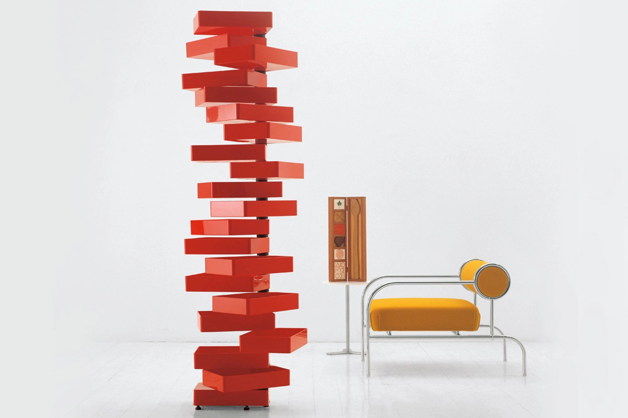
Revolving Cabinet by Shiro Kuromata for Cappellini, 1970
Kuromata's striking tower of twenty drawers revolving around a vertical metal support creates a highly functional and energetic response to the perennial storage problem.
Le Bambole
by Mario Bellini for B&B Italia in 1972
The Bambole armchair is part of the Le Bambole series, initially designed in 1972 and awarded with the Compasso d’Oro in 1979. What makes Le Bambole unique is the apparent absence of a load-bearing structure, the extreme naturalness of the shape, and the combination of comfort, softness and elasticity that their appearance conveys. Where the original construction was on a metal structure embedded in polyurethane, now the materials used are of the latest generation, starting from recycled polyethylene providing the structure. A sustainable project, thanks to the choice of materials and the construction method, that allows the components of Le Bambole to be completely disassembled and, therefore, easily recyclable.
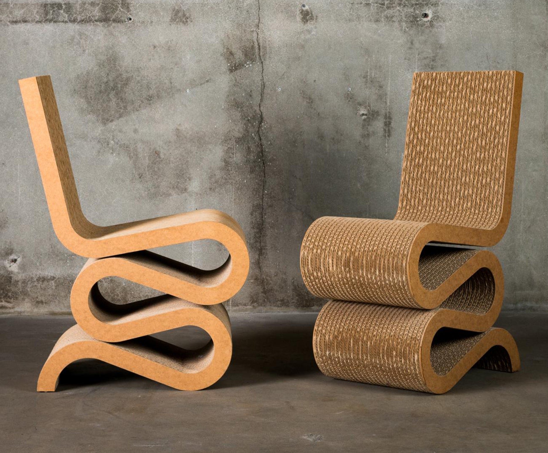
Wiggle Chair
by Frank Gehry for Vitra, 1972
In the 1960s, a trend for cost-efficient and lightweight materials led to experiments using cardboard in furniture design, reaching its apogee in Frank Gehry's Wiggle chair. "Easy Edges" perfectly describes its S-shaped curves composed of 60 layers of cardboard transformed through the designer's skill to create a durable, robust and surprisingly comfortable chair. Who knew such a prosaic material would be transformed into an icon of sustainability and high design? Gehry knew forever changing how we look at the common everyday material.
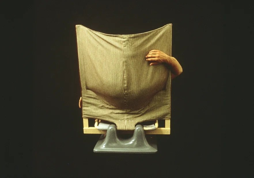
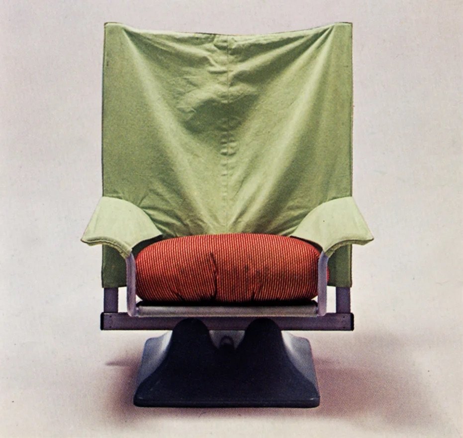
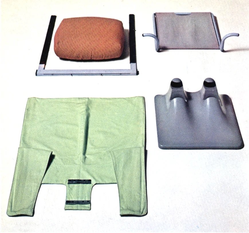
AeO Chair by Paolo Deganello for Cassina, 1973
Paolo Deganello designed the audacious Aeo chair for the radical anti-design Archizoom Group in 1973 as a response to the Scarpa brother’s squat, overstuffed Soriana from 1969. He felt it was the symbolic representation of the well-being and opulence that the group opposed with vehemence.
AeO is constructed from a modest and common fabric, with steel leaf springs, bent tubing and Moplem plastic used at that time to make the humble wastepaper basket. A grey plastic base supports a lacquered steel frame with a thick polyurethane foam and polyester cushion atop an extended cloth. It’s a blend of divergent concepts, a haphazardly half-covered object that is the antithesis of a stuffy upholstered armchair.
Inform Permanent Collection
Artemide Patrocolo Light
by Gae Aulenti, 1975
In 1975, when the U.N. declared the International Year for Women, Gae Aulenti quietly went about her work in architectural design, urban planning, and interior and industrial design — "There are plenty of other talented female architects, but most of them seem to link up with men…I have always worked for myself, and it's been quiet and educational. Women in architecture must not think of themselves as a minority because the minute you do, you become paralyzed. It is important to never create the problem."
The Artemide Patroclo table lamp illustrates her belief that "light is impressionism" with the hand-blown glass shape protected by a strong mesh of steel wire to create a mottled light that is soft and diffuse, an enduring testament to her delicate yet firm approach to design.
*Inform Permanent Collection Piece
Ribbon Chair
by Niels Bendtsen for Kebe, 1975
Niels Bendtsen, a Danish-Canadian industrial designer, gleaned his education through familial nurture and his curious nature. Bendtsen's father, a cabinetmaker, apprenticed with Jacob Kjær in Copenhagen; Bendtsen, in turn, apprenticed with his father, where he formalized his respect for precision.
His first product, a cast metal candlestick holder, sparked a lifetime of design and manufacturing. In 1973 Niels returned to his birthplace, Denmark, and plunged headfirst into design. He freelanced for the likes of Eilersen, IKEA, and Kebe—for whom he created the Ribbon chair.
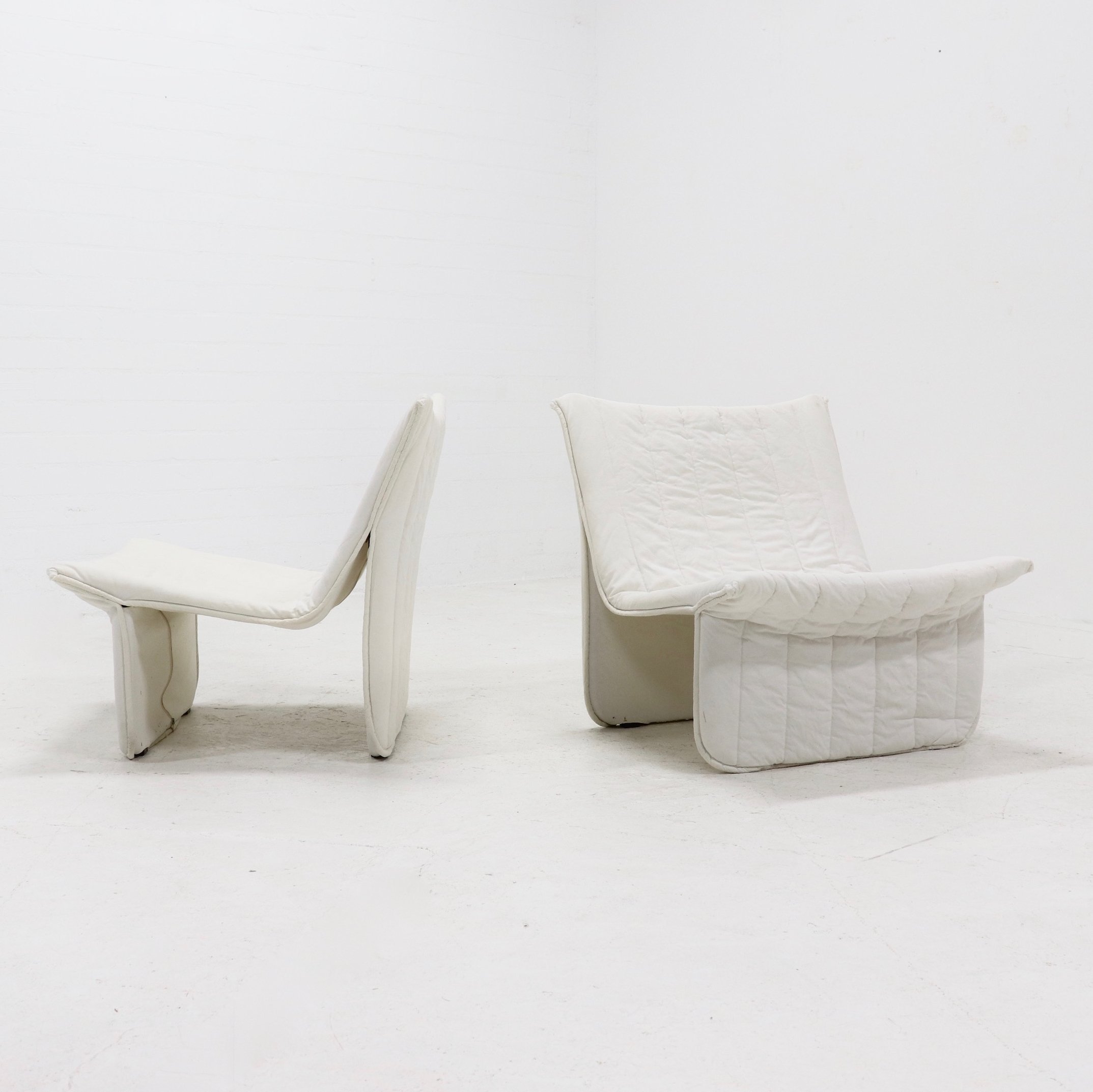
The Ribbon chair, made of tubular steel, cotton canvas, and polyester fill, is a shining example of his years of rigorous discipline and hard work, creating a chair that transcends the decades with its clean elegance and straight lines. This piece is in the permanent collection of New York's Museum of Modern Art.
Inform Permanent Collection
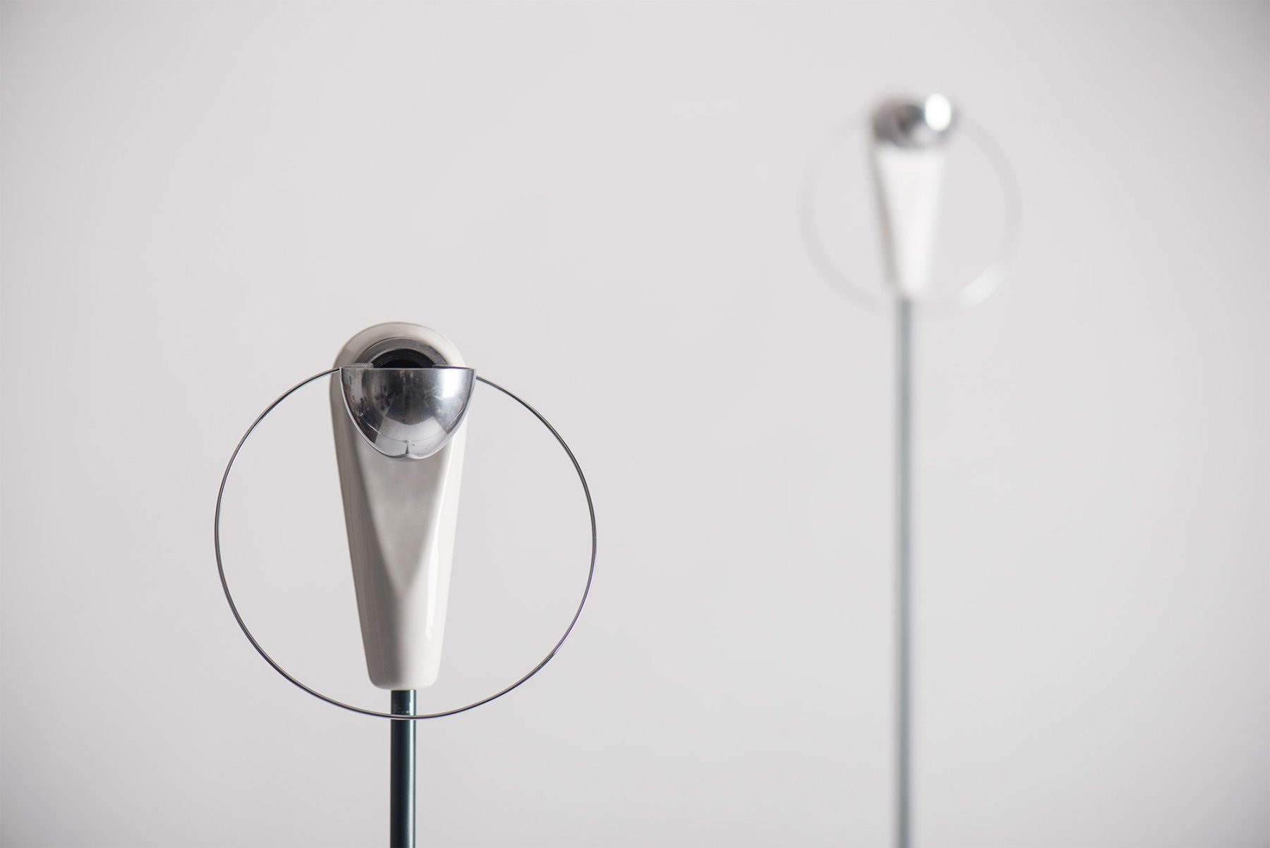
Achille Castiglioni gleaned inspiration from everyday objects, achieving a balance between technical skill, exuberant talent, and playful wit. Ordinary materials like extruded aluminum and stainless steel are used to create functional and artistic objects. His Bi Bip light is a gentle 'beep beep' calling attention to its pared-down elements: a white ceramic half-dome base and white ceramic head with a pivoting brushed metal shade with a wire halo to catch one's attention. His creations are clear examples of rigorous method, technical skill, exuberant talent, and wit combined to achieve a fulfilling, rational and emotional beauty. His work exemplifies the ideal of good design.
Inform Permanent Collection
Bi Bip Light
by Achille Castiglioni
for Flos, 1977
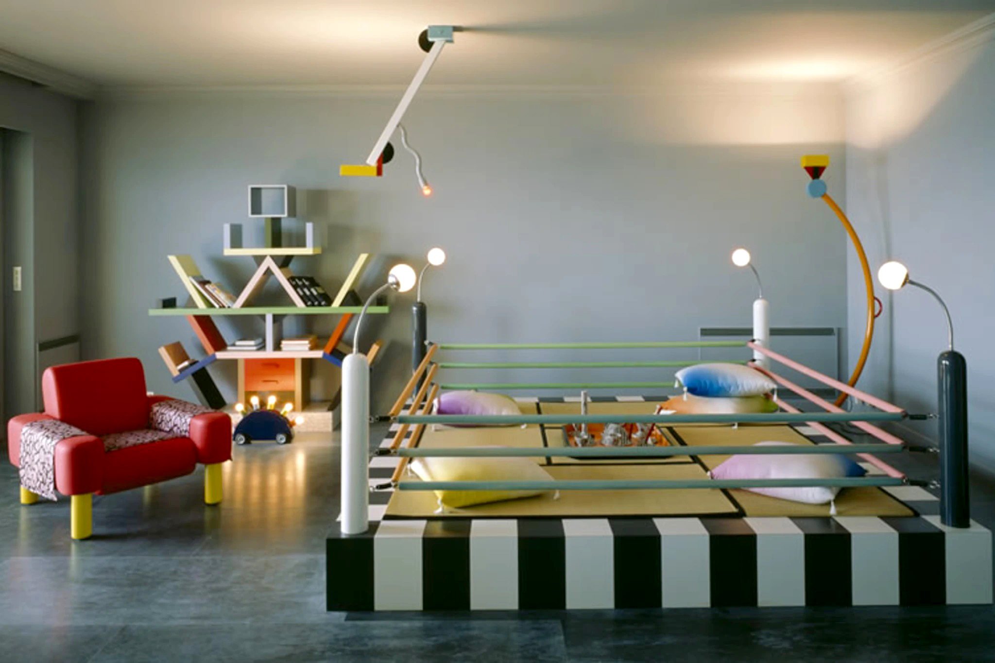
1980s
Flotation Pendant
by Ingo Maurer, 1980
Ingo Maurer nicknamed the poet of light, conjured the Flotation Pendant that appears to defy gravity. Three shades of crinkled fine Japanese paper held together with thin steel wires are grounded by a red enamelled ring used to adjust the height. The ambient illumination provides its own poetry - diffused and soft as air.
Alanda Table
by Paolo Piva for B&B Italia, 1980
Paolo Piva's Alanda table is a deceptively simple design based around a group of inverted pyramids acting as pedestals and support, with a hyper-light glass top that sits elegantly upon the base. Its design stems from the science of geodesy, which understands three fundamental properties of the earth: its geometric shape, its orientation in space and its gravity field. The Alanda table pays homage to these qualities with a subtle nod to the cosmic energy trapped within the pyramids. Piva felt design is not merely the product of a particular idea or commission but develops out of a continuous occupation with the theory of design.

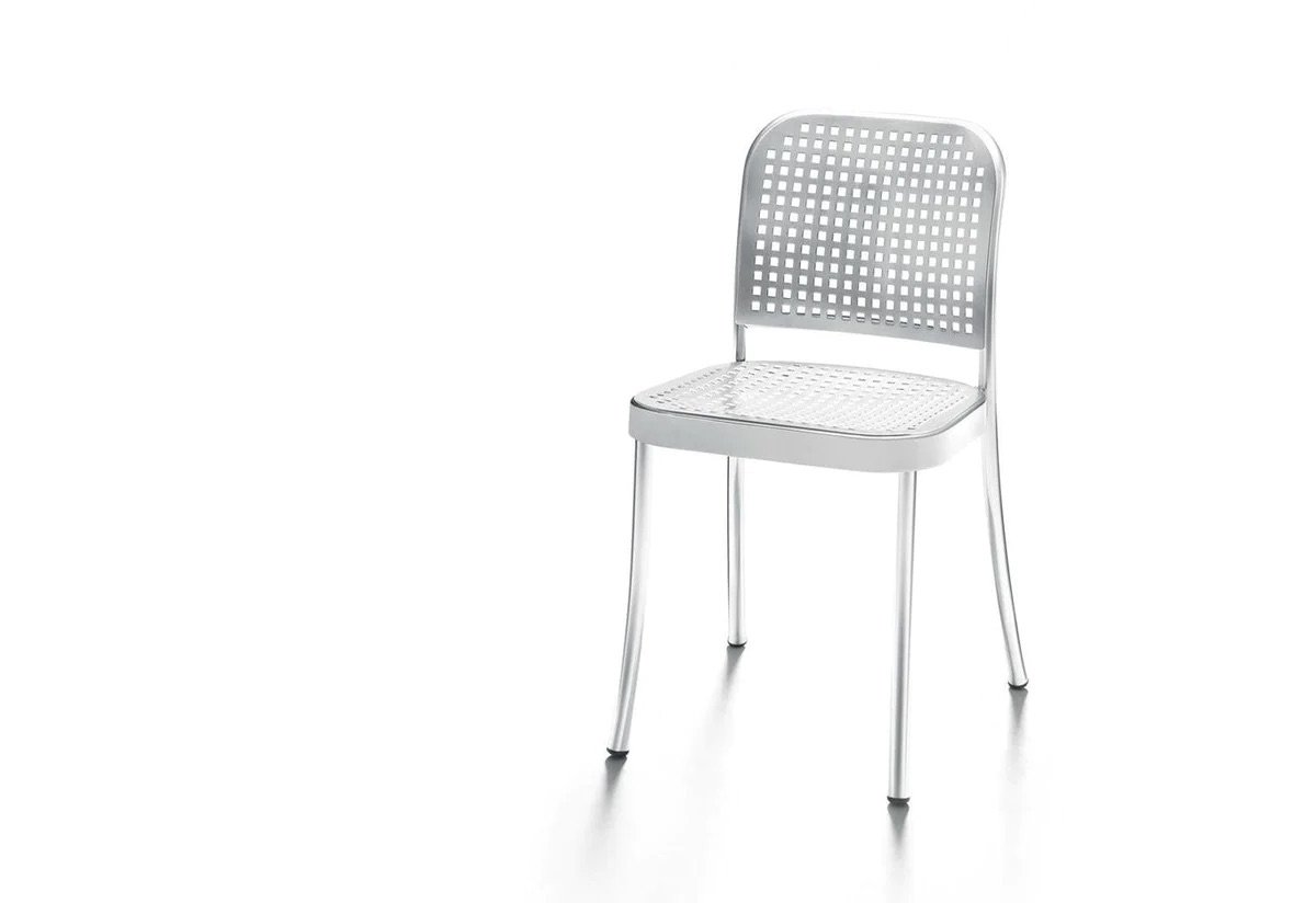
Silver Chair
by Vico Magistretti for DePadova, 1980
Vico Magistretti lent this piece his love of normal things, balancing innovation, originality and tradition to reinvent the Thonet chair, switching the classic bentwood and cane seating with aluminum. The Silver chair uses electro-welded aluminum tubes rather than beech wood and sheets of polypropylene with square holes that replace seats and backrests in cane. His most urgent and exciting contribution to design was the fusion of domestic and work spaces, balancing innovation, originality and tradition to create the Silver chair.
The Saruyama, with its geomorphic shape, offers a free interpretation of seating made up of three modules that form a large circular island when joined together. One can sit, lie down, find one's own place, and climb the Saruyama. The playful piece is inspired by Monkey Mountain (Mount Takasaki) and the thousands of wild monkeys that roam freely amongst the visitors. Kita believes that even if living environments change, basic human movements such as sitting and lying down remain unchanged, just as he has observed in nature.
Courtesy of Visitor Goods
Saruyama Seating
by Toshiyuki Kita for Moroso, 1981
by Achille Castiglioni for Zanotta, 1983
Albero Plant Stand
"If you are not curious, forget it. If you are not interested in others, what they do and how they act, then being a designer is not the right job for you."
Castiglioni's curiosity led him to find objects perched between art objects and design accessories. With its painted steel frame, small dishes in black and stable feet in black polypropylene, the Albero flowerpot stand is a subtle presence, dynamically composed, a domestic "vertical forest" that speaks to his curiosity and playful approach to design.
Inform Permanent Collection

Costes Chair
by Philippe Starck for Driade, 1984
There are many designers, but few are universally recognized as icons. The Costes easy chair marked the beginning of the partnership between Philippe Starck and Driade, elevating the designer into the pantheon of the greats. The Costes was an instant classic in 1984 thanks to its smooth lines and minimal design — a three-legged chair with a slatted backrest made of fibreglass resin, a seamless tubular frame with a rounded profile and a matte finish that will not fade, peel or rust. Best of all, it's completely recyclable. Philippe Starck has a mission, a vision: that creation, whatever form it takes, must improve the lives of as many people as possible.
Shogun Lamp • 1986 •
Shogun Lamp • 1986 •
by Mario Botta for Artemide
Architecture and memory are inseparable in Botta's work, where the changes implemented in architecture become part of our landscape. Initially released in 1986 during the height of the Post-Modern movement, Shogun has been updated to incorporate modern LED technology, creating a strong graphic presence with its black and white stripes. Light generates space through a diffuser crafted of perforated steel, casting soft light through tiny holes to create an interesting pattern of light and shadow.
Inform Permanent Collection
Circle Chair
by Hans J. Wegner for PP Mobler, 1986
Hans J. Wegner was a leader in Danish modernism known for his craftsmanship and ability to balance aesthetics with functionality and quality. Placing importance on ergonomic design, he believed furniture was art made to comfort the body. In 1986 he achieved this by creating one of the most visionary projects: the Circle chair. This chair is recognized as one of the best examples of Wegner's artistry and expertise. A specialized machine was created to make the chair out of wood, something Wegner did not believe was even conceivable. Despite its size, the chair is light, functional, and easy to move about.
“No desk lamp should make you use two hands to position it.”
Tolomeo Lamp
by Michele de Lucchi and Giancarlo Fassini
for Artemide, 1986
Michele de Lucchi and Giancarlo Fassini joined forces in 1986 to create the indispensable Tolomeo lamp, which has grown to include an assortment of sizes and styles, beginning with a heavy base and ending with a fully adjustable pivoting head. The multi-armed body is also fully adjustable, with steel tension cables providing infinite positions.
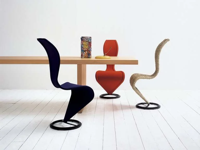
S-Chair
by Tom Dixon
for Cappellini, 1987
The historic S-Chair, born in Tom’s 1980s London workshop, is an object with an artisanal core, successfully transformed into an authentic industrial masterpiece without losing the essence of the original product. It has a dark varnished metal structure; the original version is upholstered with marsh straw; alternatively, it is available in wicker or with a fixed cover chosen from a selection of leathers or fabrics from the collection. For the marsh straw version, the weaving is done entirely by hand: a meticulous procedure that requires more than 6 hours of craftsmanship.
Joy Bookcase
by Achille Castiglioni
for Zanotta, 1989
Achille Castiglioni created objects that balance technical skill, exuberant talent and playful wit. Nowhere is this more evident than in the Joy bookcase, which celebrates its technical virtuosity and bold design. Joy is a neutral object with multiple roles: a bookcase that changes shape to fit into a corner or even standing in the centre of a room. It has the circularity of a spiral staircase with customizable shelves that rotate 360 degrees pivoting around a centre cylinder in varnished steel. It is nothing less than a tour de force of technical expertise and formidable artistry.

1990s

WW Stool by Philippe Starck for Vitra, 1990
Standing stool, seating or sprout? This unclassifiable piece by Philippe Starck was designed as part of a fantasy office environment for the German film director Wim Wenders. By ignoring functional constraints, Starck could allow his formal brilliance full rein. Is it a stool, a piece of seating furniture, or a sprout, a germinating rhizome, with three roots growing into the floor, while the shoot winds its way upward with a branch of the front “root” serving as a footrest?
Lungangolo Bookcase
by Achille Castiglioni for Karakter, 1991
Castiglioni is known to have pondered the idea of space, especially lost space. Why should the empty centimetres be ignored when they could be filled with beautiful objects? And so the Lungangolo — That’s it in English — was created. The frame comprises four slender pillars with square cross sections in between to support the square shelves placed at various heights and strengthened by a drawer and a side piece. It was manufactured in two versions to work left- and right-handed.
“I have always desired to do the opposite. Not because I have an anarchic behaviour but because I think the fundamental basis of design consists in thinking the opposite.”

Favela Chair
by the Campana Brothers for Edra, 1991
Inspired by the streets of Brazil, using low-tech materials such as cardboard, rope, fabric, wood scraps, bamboo, and aluminum wire, the Campana brothers craft furniture and stand-alone pieces that reflected the materials and spirit of their culture. Core values of freedom and human dignity lay the foundation for the possibility of transformation and reinvention. The Favela chair is a testament to their beliefs: many small pieces of the same type of wood used to craft the Favelas are cobbled together piece by piece to build a fantastic chair without any discernible frame. They established Instituto Campana in 2009 to preserve their collections for future generations and to promote design as a tool for social transformation through cultural and educational programs.
Inform Permanent Collection
Swingading
by Ingo Maurer in 1993
“Darkness and light complete and nourish each other.”
From 1984 to 2013, Bernhard Dessecker developed his practice by working alongside lighting designer Ingo Maurer Bernhard exploring the intangible properties of light. The Swingading is composed of rubberized steel with a chrome-plated brass cone near the top and features a flexible stem that can be set to a fixed position by moving with a stainless-steel weight. A small moveable shell of opaque plastic directs the light.
Inform Permanent Collection
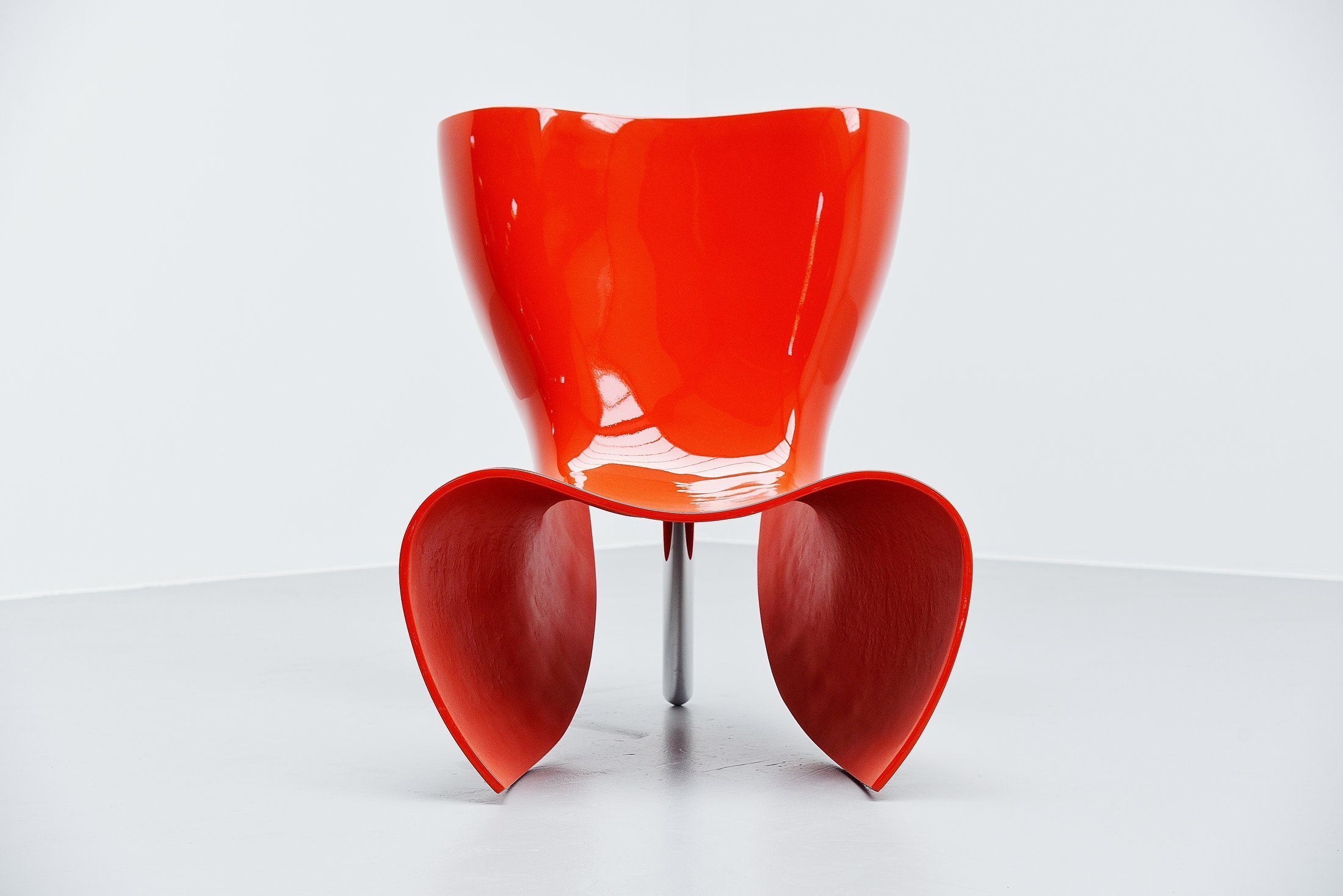
• Felt Chair by Marc Newson for Cappellini •
1993
• Felt Chair by Marc Newson for Cappellini • 1993
While preparing for what would become the Orgone chair (1994), Newson wanted to sketch a hollow variation with a sliced-off bottom with sides that continued to the floor. The Felt’s simplicity of design made it a good candidate for production. A polished aluminum base with a reinforced fibreglass body makes it suitable for inside or out. Newson’s work sits between fine art and design.

Aeron Chair
by Bill Stumpf & Don Chadwick for Herman Miller, 1994
Two heads are better than one. No one knows this better than designers Bill Stumpf and Don Chadwick, who put in years of combined research into ergonomics and design, culminating in the Aeron chair, short for aeronautics, creating the gold standard for office seating. Innovation in textiles came next in an elegant, dressy fabric Pellicle which flexes in multiple directions. Combining a deep knowledge of human-centred design with cutting-edge technology, they discovered the ideal sit — chest open, shoulders back, pelvis tilted slightly forward, to allow us to focus on the tasks at hand.
Bettula Stool
by Vico Magistretti for DePadova, 1994
Vico Magistretti’s accent piece is a hybrid: part table, part stool, clever enough to adapt to whatever the occasion calls for while offering timeless elegance to each room. Functional needs, material possibilities, technical challenges, and artistic integrity go into its creation; his paean to flexibility responds to the changing demands of daily life. His sage advice, “Look at usual things with unusual eyes.”

Romeo Moon Lamp
by Philippe Starck for Flos, 1996
Philippe Starck believes light plays the same role for a designer as words do for a writer: without it, nothing is possible. Inspired by Shakespeare’s star-crossed lover, his Romeo Moon series provides a new perspective on everyday objects in a way that transcends time. It offers a classic silhouette anchored by steel cables and a finely fluted, moulded glass lampshade. The collection focuses on iconic, classic shapes, giving them new life and a timeless look.
Knotted Chair & Fishnet Chair
by Marcel Wanders for Cappellini , 1996
Marcel Wander’s capricious marvel, the Knotted Chair is a fanciful re-imagining of a child’s dollhouse chair turned adult-size. Wanders worked with the Dutch design collective Droog Design to create an adaptation of macramé using new materials and fabrication techniques: a surprising structure made of carbon covered with aramid fibre cord and then coated with epoxy resin. An innovative object was born with an intrinsically romantic allure: a collector’s piece utterly unique in the history of international design.
Next, Marcel Wanders goes one step further to create Fishnet Chair, an elaboration on the elastic properties of the knotting technique he developed for his Knotted Chair. Part jellyfish, part fishnet, less than ten specimens were produced. It is an enduring example of Wander’s expertise and innovation in creating new materials and techniques for his otherworldly designs.
Sophisticated minimalism with playful pops of colour is found in the mod-inflected, multi-function poufs named after a much-loved childhood treat. Pop them around a living space as a table, seating or object. Young is acclaimed for his elegant, pared-down aesthetic design, which was in direct opposition to the elaborate style dominating London at the time. He has since expanded his studio to Hong Kong, allowing him to design "ridiculous things" and work with manufacturers passionate about making them, exploring the boundaries of design and embracing new technologies.
Inform Permanent Collection
Smart Pouf by Michael Young for Cappellini • 1996 •
Smart Pouf by Michael Young for Cappellini • 1996 •
Statuette Chair by Lloyd Schwan
Cappellini, 1996
At a time when Italians were recognized as the masters of design, LLoyd Schwan was the first to bring renewed interest to the American designers in New York. His work was bright, bare and resistant to rules, both playful and sophisticated at a time when most American furniture was either dully traditional or dryly modern. Constructed of reinforced fibreglass on a heavy powder-coated metal base, it fits the body in all the right places, reducing its elements to their purest form.
Douglas Coupland Collection

Mirror
by Jasper Morrison for Cappellini, 1997
Morrison’s Mirror is a double-faced floor mirror with adjustable inclination and a base and frame in satin nickel. It stands alone as an example of minimalist elegance. Jasper Morrison and Giulio Cappellini had a long and fruitful partnership which led to the introduction of more than 30 highly successful products as part of the Cappellini collection, all defined by Morrison’s distinctive design, as well as by his rigorous attention to detail, including materials, shapes, engineering, comfort, finish and colour.
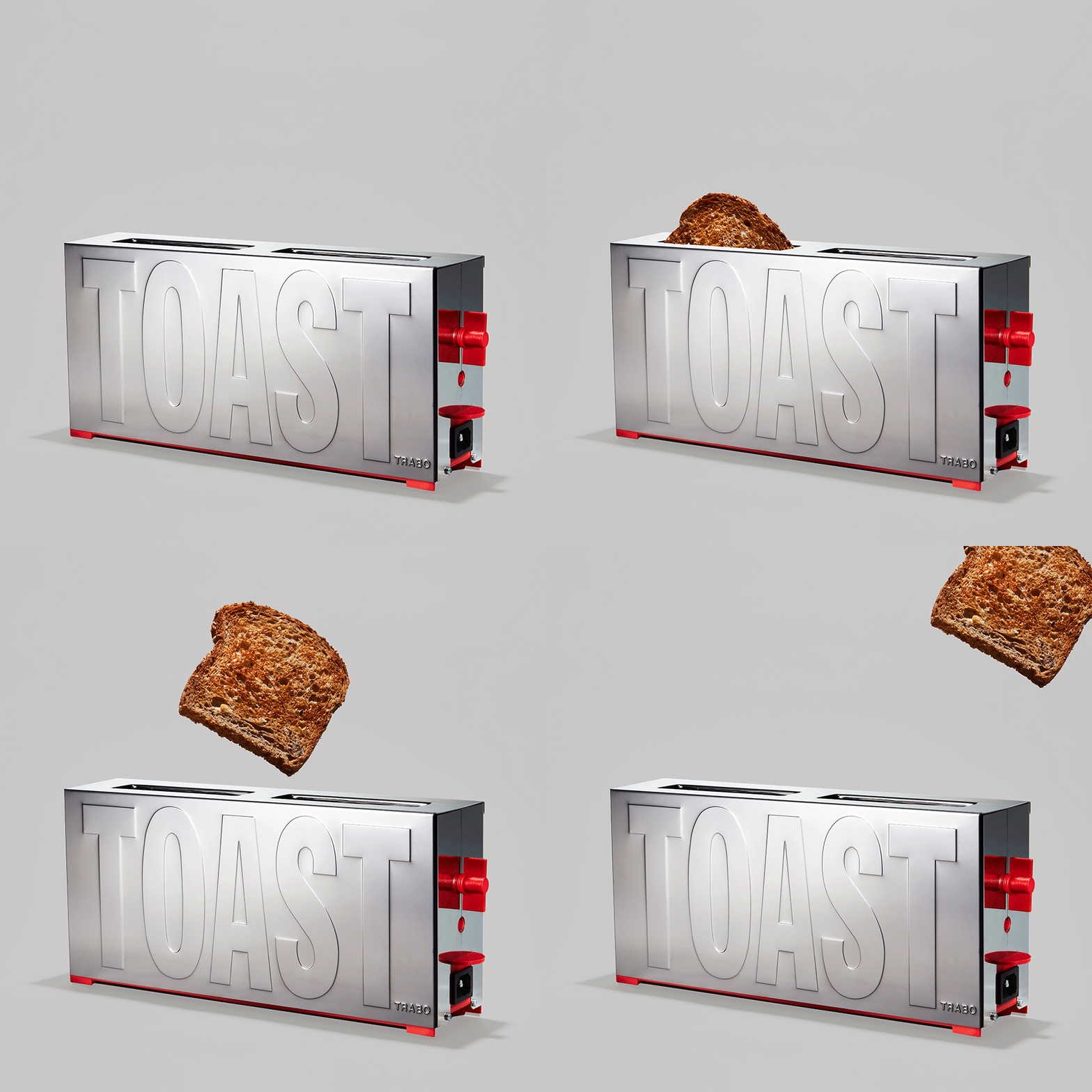
TOAST Toaster
by Gae Aulenti for Trabo, 1997
In her lifetime Gae Aulenti’s status as a preeminent architect and designer meant that the same artistic care and vision would be applied to all her projects, from museums to toasters. The noted mistress of all trades found a way to bring good taste to your morning coffee and toast with the Trabo small appliance. She stripped the components down to basics: a dial for light and dark, two slots for the bread with two oversized red clips for lifting, and TOAST embossed on the stainless steel shell.
Inform Permanent Collection
Wo-Tum-Bu Lamp
by Ingo Maurer & Dagmar Mombach, 1998
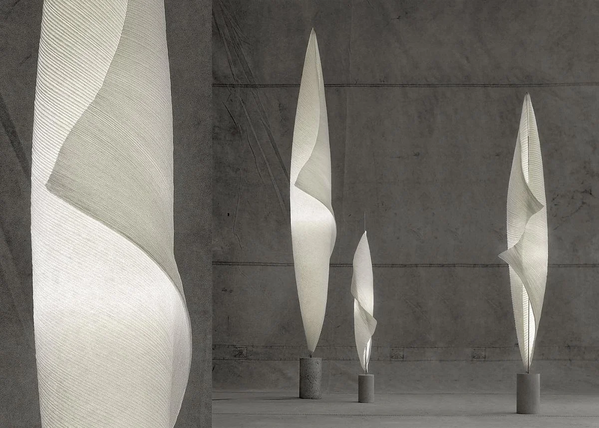
The Wo Tum Bu lamp is an homage to Isamu Noguchi's Akari Light Sculptures, characterized by weightless luminosity and sculptural virtuosity. The light is part of the Mamo Nouchies collection, formed by the first syllables from Maurer and Mombach, with a pun on Noguchi. Each Wo Tum Bu lamp is a unique piece carefully handcrafted from handmade paper, weighted by a metal base. It provides dimmable, cozy light and is impressive even when switched off.
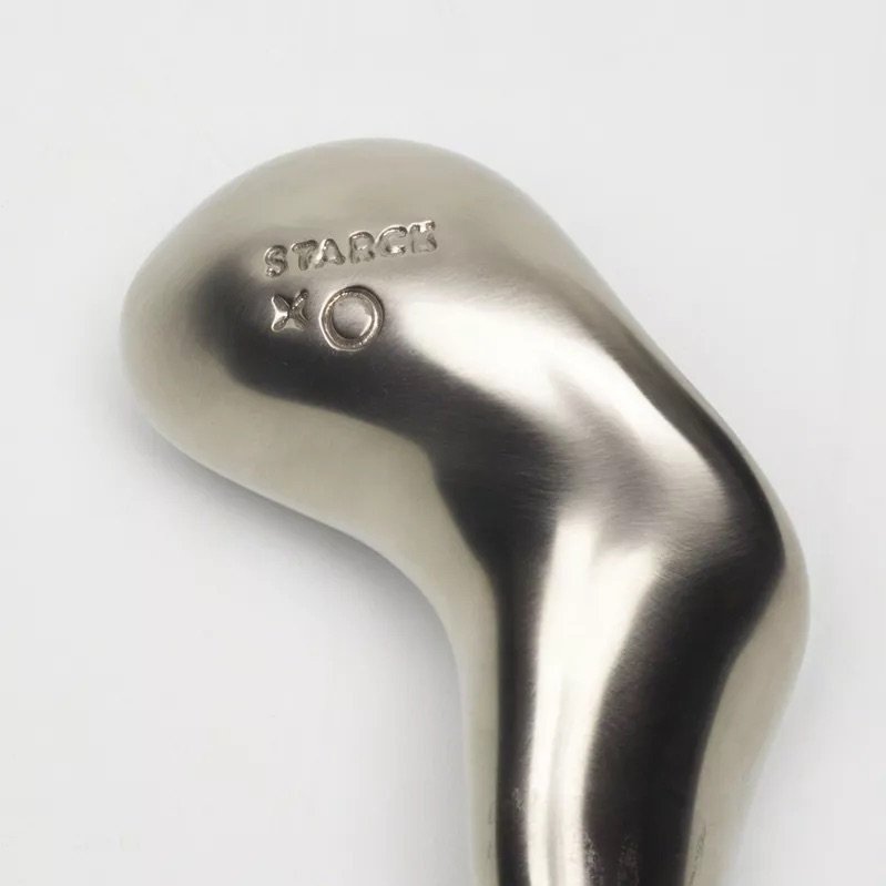
POAA Dumbells
by Philippe Starck for XO, 1998
Philippe Starck approaches each hotel re-design as a director, gleaning inspiration from the hotel's unique character and paying utmost attention to every detail, no matter how insignificant. His 1998 renovation of the Sanderson Hotel in London continued to push the boundaries of what is real, taking inspiration from "mental games, optical illusions, eccentricities, dreams and successful impossibilities."
And what could be more impossible to imagine than a set of hand weights doubling as objets d'art waiting for you in your room? The are sensuous and sculptural and feel as if they are moulded by and from your soft hand while retaining steel's cool, stone-like quality. They illustrate how the smallest detail in Starck's oeuvre can still lift us out of the ordinary into a world of imagination and possibilities.
2000s
Hudson Chair
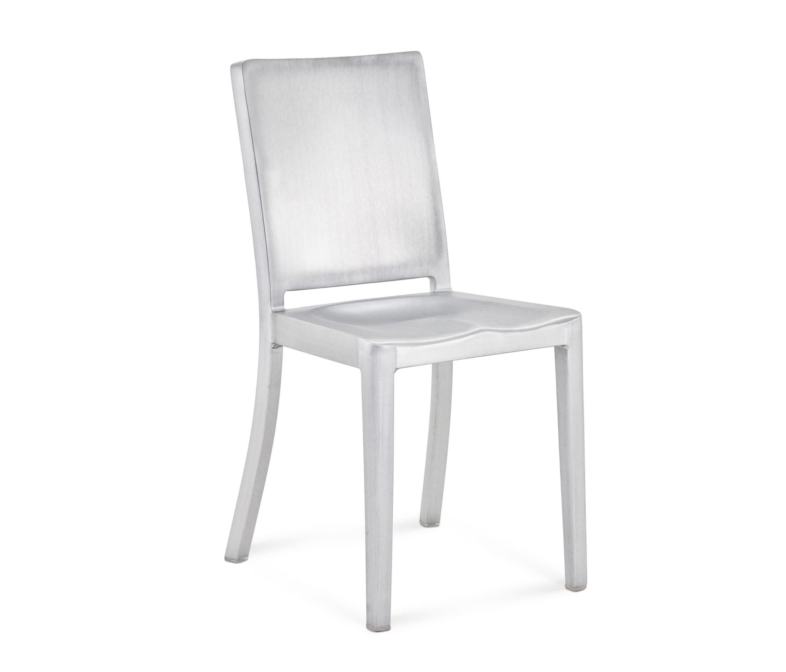
Emeco x Starck, 2000
It was the beginning of the 2000s when designers worked with hoteliers to create hotels that were part of the "experience economy," making boutique hotels that felt more like discos with designer furniture upping the experience. Phillips Starck collaborated with Emeco to create a shiny chair out of recycled aluminum, a riff off Emeco's Navy chair from 1944, for the Hudson Hotel. Starck said they developed the reworked version by "washing the details from the Navy chair."
"It is a chair you never own; you just use it for a while until it is the next person's turn. A great chair never should have to be recycled. This is good consideration of nature and mankind."
Sleeper
by Niels Bendtsen
for Bensen, 2002
Conventional sofa beds involve complex, heavy systems of springs and levers that require several motions or placements. The result is inadequate spring suspension and poor cushioning, compromising comfort in sleeping or sitting. What differentiates the Sleeper from other sofa beds is that the fully supported foam seat and back change position in one smooth motion.
Casper Candle
by Tobias Wong, 2003
Tobias Wong's Casper is a Baccarat crystal candlestick topped by a candle-shaped, crystalline paraffin lamp. The flame burns paraffin oil, so the candle will never melt. He insisted that it be pronounced in French, cas-pair.
Nicknamed "the enfant terrible of the design world," Wong challenged the legacies of 20th-century creativity, blazing his own path, making works as diverse as Sun Jar and the conversion of a Philippe Starck chair into This is a Lamp, illuminating his own trail for the short time he was here.
2.4 Chair
by Omer Arbel, 2003
The coveted 2.4 chair by Vancouver's own Omer Arbel is a cast resin version with a copper skeleton. The resin is cast sequentially in layers on their side, so an endless variety of unique opaque and transparent colour combinations are possible, creating depth and luminosity. The chair shows the value of a good foundation and the playfulness of hiding it.
Courtesy of Bocci
Chair One
by Konstantin Grcic for Magis, 2003
Chair One is constructed just like a football: several flat planes assembled at angles to each other, creating a three-dimensional form. Konstantin Grcic tackled this project by working with die-cast aluminum to construct a chair that retains the structural logic of a football while actually being something you can sit on, a design that recalls the wire rod chairs that such designers as Harry Bertoia and Charles and Ray Eames produced in the 1950s and 1960s.
14 Series
by Omer Arbel for Bocci, 2005
Traditionally, chandeliers have been understood as central, sculptural installations that become a room's visual focus. The 14 Series, designed in 2005, challenges this concept by playing with the placement of each light, disrupting the symmetry to create an unexpected ambient interpretation of such a weighty concept as the chandelier, achieving its power through a strategy of composition and clustering. The 14 fills the volume of a room, making the height and shape of its dimensions understood to the inhabitants in a direct physical manner.
Courtesy of Bocci
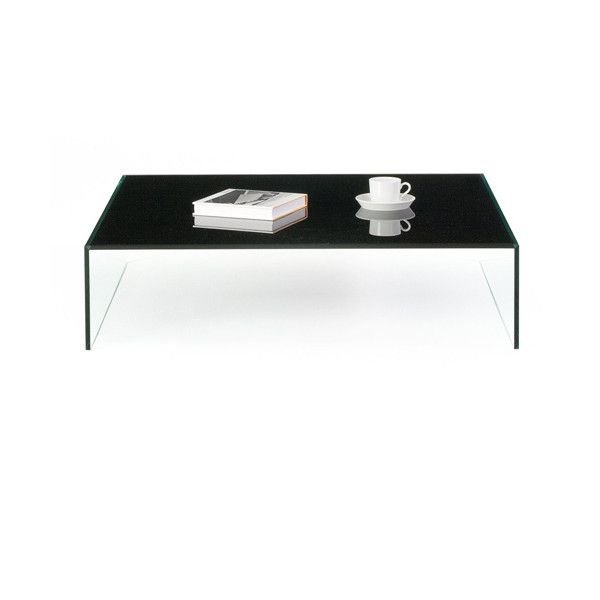
Pool Table
by Niels Bendtsen for Bensen, 2005
At first glance, the Pool table appears like a square floating above the floor. The clear glass sides and coloured top combine to make a table that is straightforward in its aesthetic appeal and exact execution.
Inform Permanent Collection
K Tribe Light
by Philippe Starck for Flos, 2006
"Everywhere, I'm looking to reach elegance and intelligence."
Philippe Starck, known for his ability to create objects that demand the most from the least, designed the K Tribe family of products as part of his vision: creation, whatever form it takes, must improve the lives of as many people as possible. The wall lamp provides diffused light through a transparent diffuser offered in different colours. Streamlined and intelligent, it pushes boundaries while reflecting his focus on positive reduction and environmental consciousness.
Mr. Bugatti Collection
by Francois Azambourg for Cappellini, 2006
The Mr. B. Collection, evoking the automobile industry, is an homage to fast cars and hot colours. Designed on a monocoque chassis principle, also called structural skin, it is a system in which an object's external skin supports the load like an eggshell. Steel-injected polyurethane foam creates a crumpled effect, painted in the bright shiny colours of the enamel paints made for the most famous cars in the world.
Douglas Coupland Collection
Hot.Hot Brass Table Lamp
by Ingo Maurer, 2006
From the quicksilver mind of the creator of the archetypal Bulb lamp (1966) comes the dramatically different Hot.Hot Brass table lamp. Ingo Maurer nicknamed the poet of light, assembled a light that was part protractor, part sculpture. It directs a cone of halogen light through an adjustable lens system, allowing laser focus from a halogen light.
Leatherworks Armchair
by the Campana Brothers for Edra, 2007
The aftermath of a minor explosion in the Campana brothers' studio resulted in a moment of serendipity when the scattered pieces of furniture and materials landed. They collected all the debris and got working. The Leatherworks armchair is a meditation on the accumulation of materials, in this case, leather, to create fantastic shapes that are half chair, half animal. Layer upon layer of alligator and reptilian printed leather of varying grain size is piled on haphazardly, but the effect is anything but. Crafted to provoke a visceral reaction, the brothers delight in shifting the aesthetics of taste towards the distasteful, confronting us with the ideas of transformation, reinvention and the integration of craftsmanship in mass production.
Inform Permanent Collection
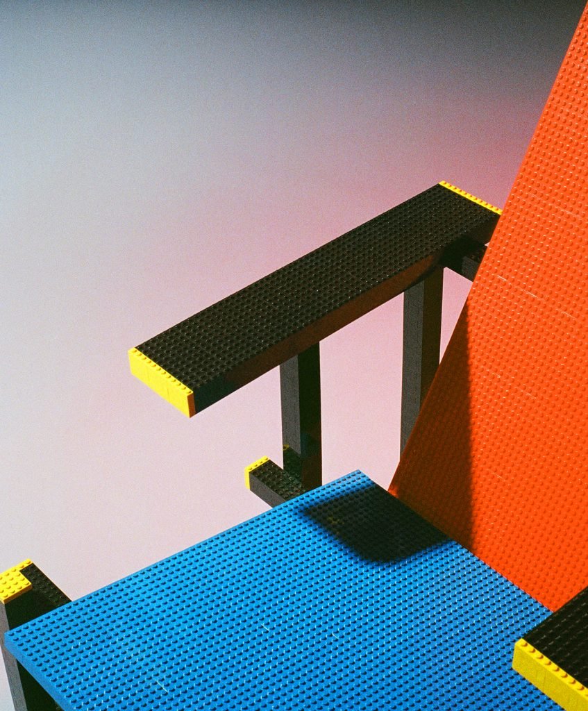
Red Blue Lego Chair
by Mario Minale, 2007
When Mario Minale was looking for something unexpected in a project of making a copy of an icon, he found something in the spirit of Lego and Gerrit Reitveld’s Red Blue chair (1918). It is not necessarily comfortable, but a great example of thinking outside the box. Individual Lego blocks were used to construct the chair, which became 6% larger than Reitveld’s original. Minale asserts that making a copy doesn’t always turn out a copy; it is an authentic act that can have new outcomes. Copyright laws prevented it from being mass-produced.
Inform Permanent Collection
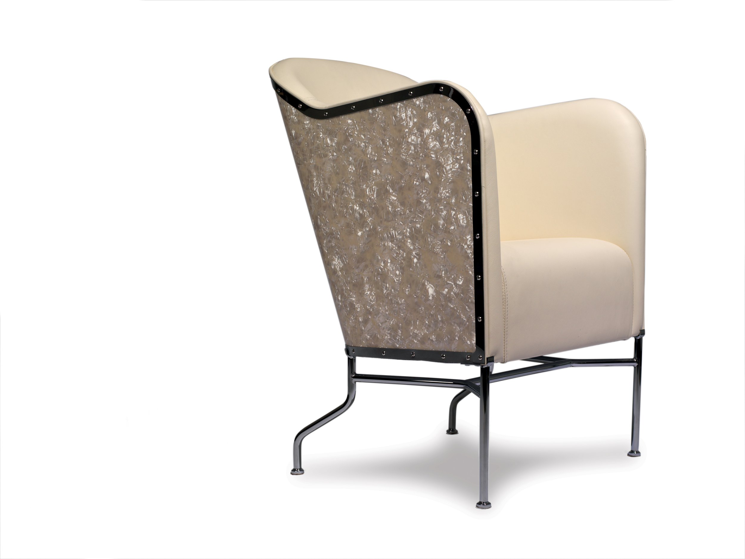
Birdland Chair & Star Chair
by Mats Theselius for Källemo, 2009
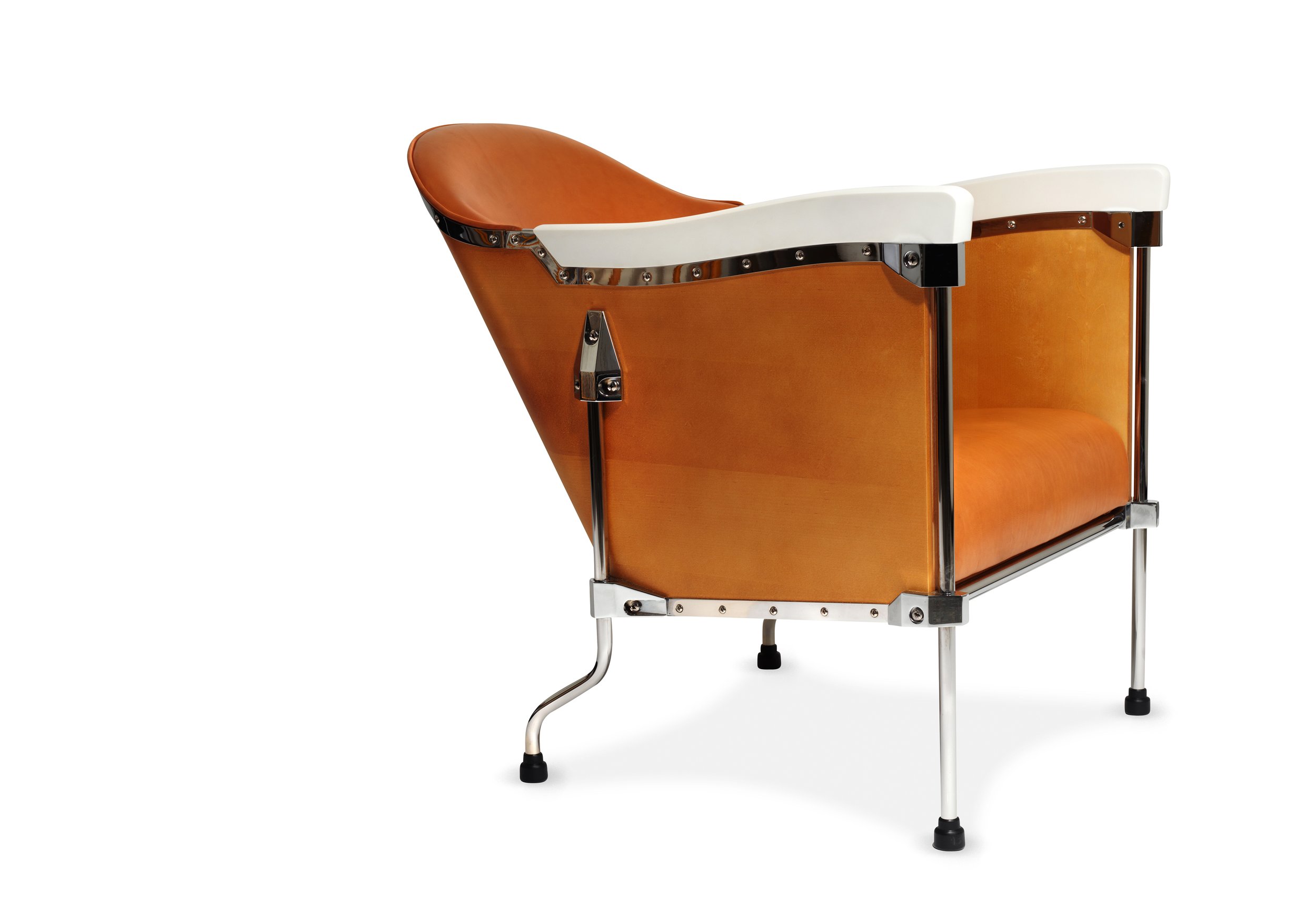
Källemo — Sweden’s best-known avant-garde furniture design company, specializes in working with designers to create limited editions such as the duo of drum-inspired chairs by Mats Theselius, whose work is a fusion of design and art. The Birdland chair comprises a birch veneer backrest, chrome, steel, Corian armrest and local Swedish Tärnsjö leather, hinting at the beauty and complexity of a drum kit. His Star chairs take inspiration from the pearled surface found on drum kits, a nod to one of his passions as a musician. It harkens back to the club chairs of the past, updated with squiggly legs, chromed steel and leather upholstery.
These chairs march to their own beat, incorporating pieces of a drum set with its leg construction, drum skin and choice of materials, transforming the musical instrument into a unique piece of furniture.
Inform Permanent Collection
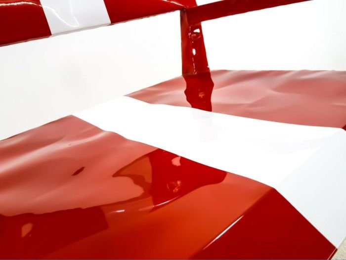
Bugatti Racing Chair
by François Azambourg for Cappellini, 2009
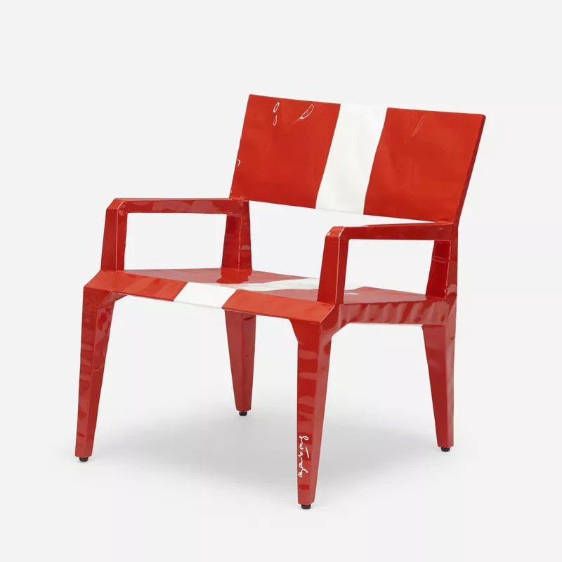
François Azambourg, known for his combination of science, technology, and the applied arts, captures the spirit of the racecar in this limited edition of 99 signed and numbered Bugatti Racing chair. Produced by the Italian firm Cappellini, it is assembled with a metal plate injected with polyurethane foam and lacquered polish, a technique used to achieve lightness and strength. The flaming red body with a white racing stripe adds the finishing touch, a model of simplicity and fun.
Inform Permanent Collection
2010s
Paper Planes
by Doshi Levien for Moroso, 2010
The prosaic material of folded graph paper becomes the inspiration for the Kvadrat remix fabric in Doshi Levien's Paper Planes seating system, launching it into something light and lux through the incongruous addition of Swarovski crystals arranged in geometric lines. The chair achieves lift-off thanks to a wonderfully aerodynamic design that provides solid, comfortable seating while appearing to defy gravity. The Scottish/ Indian duo of Doshi Levien's hybridized mindset brings technological innovation and craftsmanship to the fore across furniture, textiles and product design.
Inform Permanent Collection
Format Shelf
by Niels Bendtsen for Bensen, 2010
Dividers can be placed in any pattern to create unique sculptural and functional configurations, ideal for various applications and environments.
The use of premium materials and carefully chosen proportions create a refined and visually intriguing bookcase, while its deceptively simple construction hides its adaptability and strength. Solid aluminum bars reinforce each shelf and contain holes to secure the dividers wherever desired.
Spun Chair
by Thomas Heatherwick for Magis, 2010
Thomas Heatherwick created an entertaining symmetrical rotational form in aluminum that is comfortable to sit in, and — it spins! Heatherwick later develop a version using rotation-moulded polypropylene covered with grooves — like those found on vinyl records. Upright on its own, it resembles sculpture; laid on its side, it lets you lounge comfortably and spin around 360 degrees. Out of their workshop and design studio in Central London, Heatherwick creates buildings, spaces, objects and infrastructure, prioritizing those with the most significant positive social impact. Working as practical inventors with no signature style, they seek to design soulful and exciting places without any fixed design dogma.
Lighthouse Table Lamp
by Rowan & Erwan Bouroullec for Established & Sons, 2010
A beacon of good design, the Lighthouse table lamp was designed for Established and Sons with Venetian glass maker Vinini. The fixture consists of a stone base with a bent aluminum arm that balances on its tip a removable mouth-blown orb whose shape is informed by the shape of a lighthouse lens. Since forming their studio in 1999, the Bouroullec Brothers have forged elegantly clever timeless pieces that transcend their function, creating wonder in the home.

Husk Chair by Patricia Urquiola
for B&B Italia, 2011
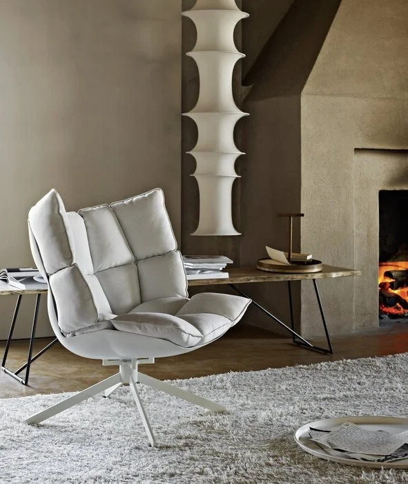
Patricia Urquiola’s Husk chairs invite you to relax atop a soft cushioning covering the hard shell made of Hirek, a plastic material made of recycled and recyclable polymers. Comfort and sustainability are at the forefront of her creations, balanced by the spirit of continuous experimentation.
“Playing is the real way to work. The longer you have to play and enjoy living and working, the better.”

Lou Read Chair by Philippe Starck for Driade, 2011
Phillippe Starck's friendship with musician Lou Reed began in 1996 at the Hotel Monceau in Paris. This friendship was immortalized fifteen years later in the Lou Read chair as part of Starck's renovation of that hotel. The sculptural curves are an invitation to sit back and relax. On the project, Starck said, "This project is a reminder that it is far better to spend time in conversation or reading activities than in front of the TV or computer."
Hommage à Sigurd Lewerentz Chair
by Mats Theselius for Källemo, 2012
Legendary Swedish architect Sigurd Lewerentz was known for his work that created an "indefinable atmosphere" and "sense of place." Theselius' homage to Lewerentz incorporates repurposed Verdigris-coated copper plates from the Petri Church in Klippan, armrests in ebony, and a coppered steel frame covered in jacquard woven fabric by Mats Theselius himself to create a piece that has the patina of the past while rooted in the present. The idea for the limited edition chair came to Theselius while visiting the Petri church with a group of interns, where the roof was being removed during their visit.
Inform Permanent Collection
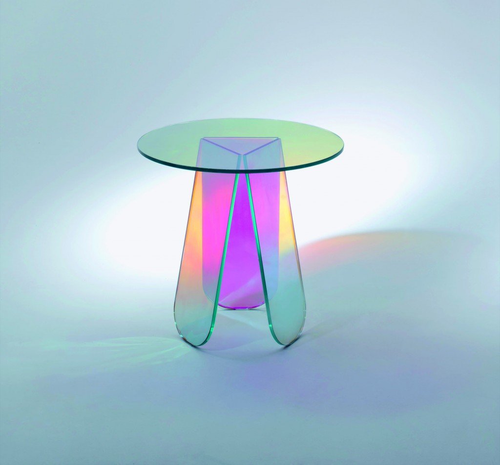
Shimmer by Patricia Urquiola for Glas Italia
• 2014 •
Shimmer by Patricia Urquiola for Glas Italia • 2014 •
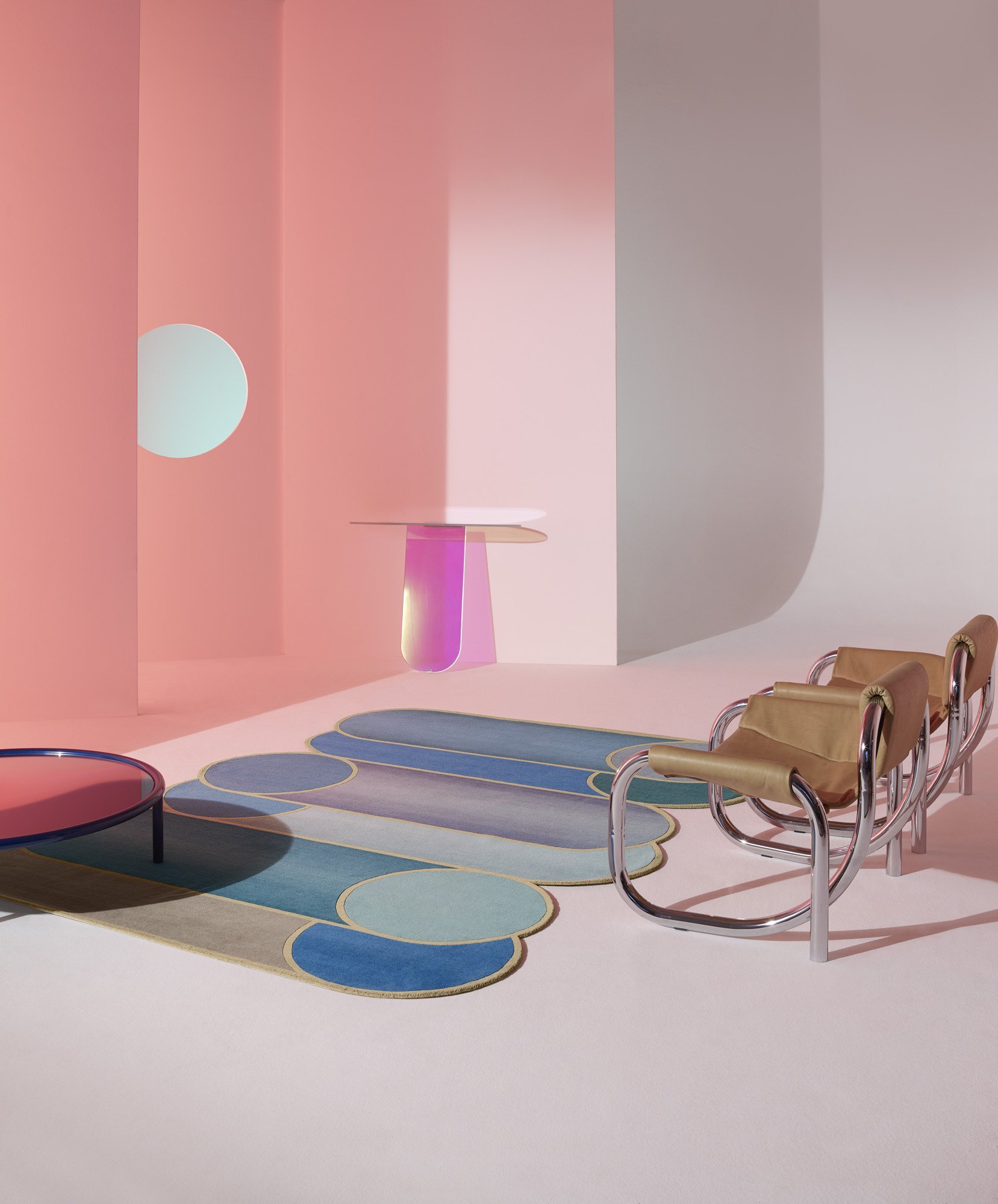
The Shimmer Tavoli is made with nuanced surfaces characterized by a unique iridescent multichromatic finish which shifts according to the angle of the light source and the viewer's vantage point, bringing fleeting images, thoughts and sensations to mind. Reflections on the ephemeral, as light plays on its surface, bring to mind Urquiola's belief "time is a constraint to destroy and then reinvent."
Captain Flint
by Michael Anastassiades for Flos, 2015
Michael Anastassiades wanted to design a light that was dual purpose: illuminating the space with ambient lighting, with a rotation that offers a dim companion for reading. The Captain Flint floor lamp is a sophisticated display of geometry and minimalism positioned between fine art and design to provoke dialogue, participation and interaction. During the design process, noticing a cone resting delicately on its point on a rotating rod, Anastassiades was reminded of Captain Flint, with his parrot sitting attentively on his shoulder, creating a notion of balance.

Ella Chair by Jacopo Foggini for Edra, 2015
Each Ella, or “She” chair, is a one-of-a-kind pedestal chair that demonstrates the unique qualities of polychromate, achieving a jewel-like quality that allows light to pass through. Jacopo Foggini discovered the creative possibilities of methacrylate and polycarbonate, making car reflectors while working in the family business. He began manipulating the materials by hand rather than moulds in objects that crossed the boundaries between sculpture and design. The flower shape in tones of blue and green is anchored by a “stem” that gently revolves, evoking elegance and finesse, sitting gracefully in the space between art and design.

Superloon
by Jasper Morrison for Flos, 2015
Superloon is the moon burning bright — broad and diffused light that can dim to a soft glow from cool to warm. The innovative use of LED technology, known as Edge Lighting, allowed Morrison to send light sideways, incorporating it into the edge of a flat composite disc of translucent white material, making it appear of a flat white disc.
Cicladi Table byJacopo Foggini for Edra, 2018
The unique Cicladi tables from Foggini are a pastiche of ancient and modern aesthetics. Seen from above, they resemble islands with their jagged edges, arranged in groups or singly. Tables are available at various heights grounded by a cone-shaped metal base topped with Tuscan alabaster tops from the walled mountaintop town of Volterra.
Miro Mirror
by Francesco Bolis for Driade, 2018
Francesco Bolis, known for his architectural photography, captures the dizzying view of Italy’s oldest shopping gallery in Milan, the Galleria Vittorio Emanuelle. Bolis worked with Driade to translate the image, laying the image on a screen that offers a mirror on the rear side and a photographic image printed on a transparent film on the other. The triptych of three panels gives the sense of the intricate geometric spider web that captures the spirit of the word Miro itself: amazement, surprise, astonishment and wonder.


